
The Rate the Dress before last was spring-heading-into-summer, last weeks was autumn-heading-into-winter, this week I’m combining both trans seasonal trends in one vivid green outer garment.
Last week: an 1890s dress in dark green ribbed velvet and chiffon, with appliqued polka dots, puffed sleeves and more
Ratings for last week’s Hallee dress fell into two distinct camps: loves, with an average rating of 9.5, or people who thought it was too quirky, with an average rating of 7.
Which, for once, is exactly what I’d predicted the response would be. Usually I have some theories, and then some of the responses come completely out of left field, but this time I was spot on (haha).
The Total: 8.3 out of 10
A rating that reflects almost no-ones scoring!
This week: a bright spring green pelisse
It took me a long time to find the right garment to feature for Rate the Dress this week. I finally decided to stick with my trans-seasonal theme, with an overgarment for keeping you cozy in cold weather, in very fresh, spring-y colours.
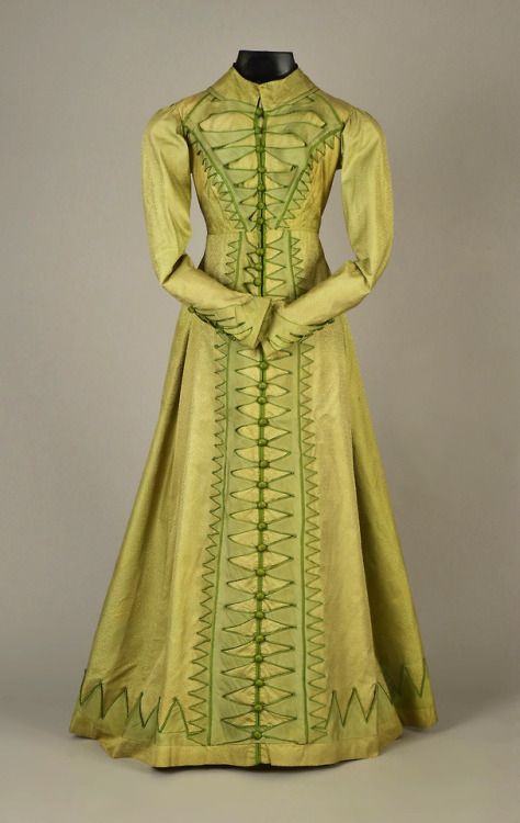
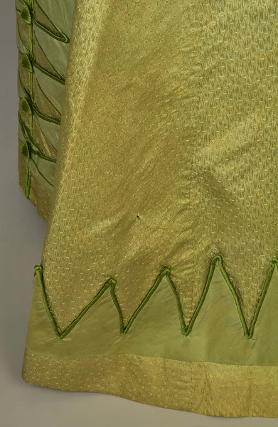
This late ‘teens pelisse would be worn over a dress, like a full length coat. Although an outside garment, it was clearly worn more for fashion than practicality. The figured sarcenet silk would spot if it got wet, and is too thin to add much warmth.
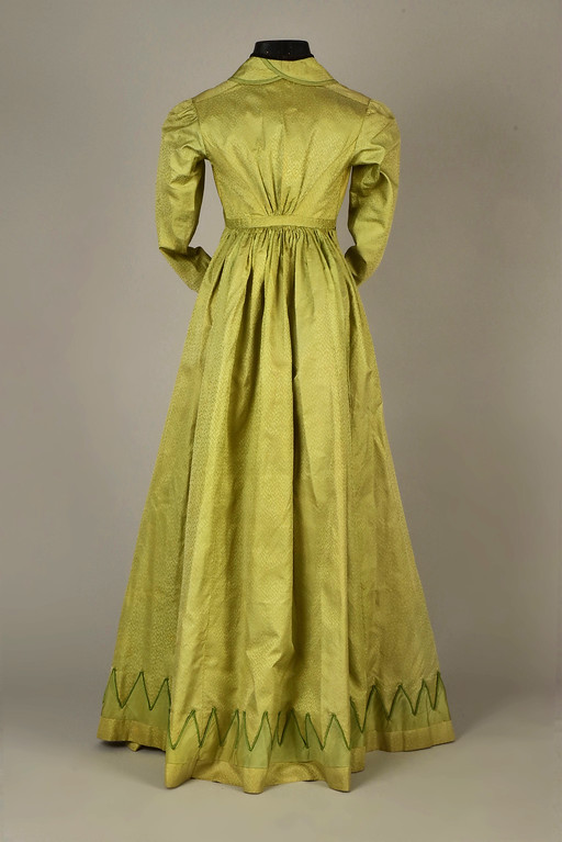
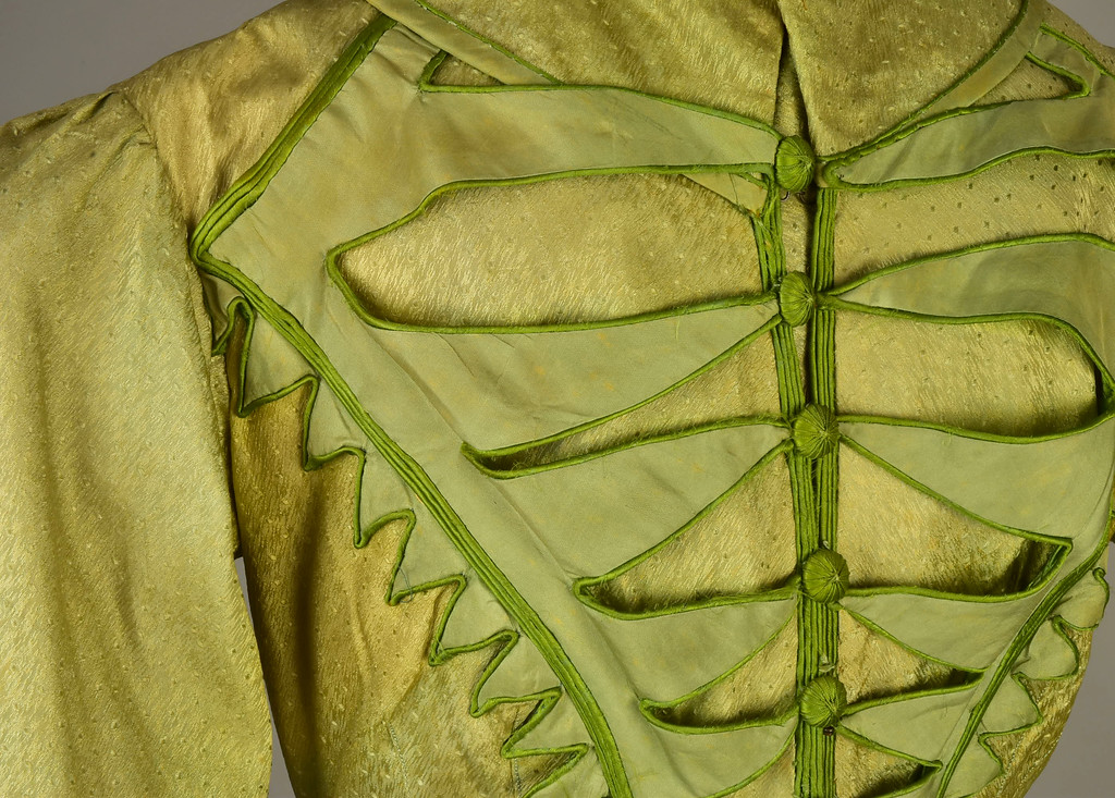
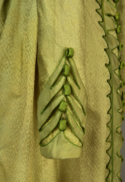
The pelisse features lavish dyked trim and non-working decorative buttons which run down the entire front of the dress-coat.
Note the piped edges of the trim, which varies between single and triple rows of piping.
It’s possible that the vivid green trim of the pelisse is Scheele’s Green, the so-called arsenic green, but it’s highly unlikely. The use of arsenic green as a dye for fabric, particularly silk, is hugely exaggerated in pop culture fashion history. Scheele’s Green is a pigment, rather than a dye: it was painted on to surfaces, so was used in wallpaper, leatherwork, and to colour paper leaves for fake flowers, etc. It wasn’t particularly suitable for applying to fabric – particularly not silk. In addition to being highly toxic, Scheele’s Green contains copper, which is very unstable when combined with sulphur, which all silk contains. When it was applied to fabric it was usually linen and cotton. On silk it would darken and discolour very quickly.
There are bright green mid-Victorian silk dresses which have been identified as being dyed with Scheele’s Green based on tests which determined that they contained arsenic – but I’m not entirely convinced that the tests ruled out arsenic contamination from other sources. Arsenic was a popular pest deterrent well into the 20th century, and I’ve worked for museums that had entire historical collections that had been treated with arsenic in the 19th and early 20th century to protect them from insect and rodent damage. Every dress in those collections would probably test positive for arsenic.
Finally, this isn’t arsenic green, because it isn’t arsenic green: the colour isn’t right for arsenic green, which is more emerald, and less yellow spring-green-y (but since every third dress of any shade of green, from any date between 1750 and 1930 that I’ve posted on IG in the last four months has gotten at least one “oooh, it’s poisonous, it’s arsenic green” comment I’m heading things off at the pass! 😉 )
So, please consider the aesthetic merits of this garment without worrying that it made its wearer very ill, as that’s most unlikely.
(climbs down from soapbox)
What do you think of it?
Rate the Dress on a Scale of 1 to 10
A reminder about rating — feel free to be critical if you don’t like a thing, but make sure that your comments aren’t actually insulting to those who do like a garment. Our different tastes are what make Rate the Dress so interesting. It’s no fun when a comment implies that anyone who doesn’t agree with it, or who would wear a garment, is totally lacking in taste.
(as usual, nothing more complicated than a .5. I also hugely appreciate it if you only do one rating, and set it on a line at the very end of your comment, so I can find it! And 0 is not on a scale of 1 to 10. Thanks in advance!)
The only thing that I find appealing, is the back of the collar. The baubles on the sleeves are sad. I think they were made from the leftovers from the miles of piping made for this monstrosity. The oramentation on this gown ruins the dress.
2/10
It’s very striking, that combination of yellow-green with apple green piping for trim. The collar, the Vandyked trim, they are all well-executed and not excessive. The sleeve ornamentation with the green loops–amazing!
And yet, I think that this dress fails my basic test; would a woman (any woman; not necessarily me, or anyone who resembles me) look more beautiful wearing it? I can’t imagine any woman whose complexion would be flattered by that yellow green.
8 out of 10, because I can’t be sure there isn’t a black girl, or a pale-skinned white girl with black hair, or someone else who would look lovely in this.
I find this very appealing, especially how the ornamentation lends an architectural element, and to my view is very pleasingly arranged. Love the color and am amazed at the skill that must have been required for all the piping.
The Scheel’s green information was fascinating, so thanks.
9 of 10
10/10 for me, I love it! The colour is amazing and I have a shawl I knit in that colour which everyone loves on me so I’d definitely wear it. The shape is gorgeous and I love the piping and the buttons from that piping too. The only thing I’m not quite happy about is that the two fronts aren’t quite even when the decorative van-dyke bits are buttoned up, but I’m not going to take points for that.
I love this “dress”. The color is striking and I appreciate the different shades of green on the piping and the main fabric. I especially love the geometric/architectural lines in the detail/piping. I feel like it’s a bit ahead of its time with an almost art-deco feel. I’d wear this in a heartbeat! 10/10
Normally I’m there for all pelisses, but I can’t get behind that yellowy lime green. I know people love it, but it is just not my thing. Also the decorations in that zigzag pattern just remind me of something, like maybe a crocodile costume a kid would wear? So I love the silhouette, the workmanship is really lovely, but aesthetically it just is hitting all the wrong notes for me. Loved the arsenic info though!
6/10
I am not a fan. Makes me think of a dinosaur.
I like the back!
5/10
This is lovely. There is a tremendous amount of handwork, yet the repeating pattern gives it a look of simplicity. The colors are beautiful together. While they aren’t ones that excite me much, I think they would have seemed very refreshing in the early spring. 9.5/10.
Is it Arsenic Green 😀
Sorry I couldn’t resist, I’ll get back on task now…
I love it!
I love the shape, I love the details. Just think about how much work went into all of that shaped piping. It reminded me of all of the shaped hems I did when I was making Irish Dance dresses.
The colour is very much of it’s time and was designed to make it’s wearer look pale and it probably did that and some! We’ve also got to remember that it’ll have faded quite a bit in 200 years.
10/10
10/10 from me! I love the colour, and it reminds me more of a fading leaf coloured fairy dress than a dinosaur or crocodile, neither of which are that colour anyway. The detail is amazing, and decorative without being too showy. I’m a blue eyed blond, and recently made and wore a 1850s outfit in pea green silk, I can vouch for it making one look very pale indeed.
I love everything about this! The detail work is amazing. The only thing I don’t like is the fact that I can not wear that color! (BUT I do love that green) It would be beautiful on someone with the right coloring. 10/10
As a garment I have mixed feelings. I love the triangles, but not the tendrils across the chest or the colour combo. However, as a costume for an 1890s superhero and/or villain I approve entirely. It reminds me of Superman, with that motif on the chest.
9/10
1820s superhero. 😉
I would 100% wear this in a different color. This green would probably make me look sickly. That being said I quite like the design though the trim where the bodice meets the skirt looks mismatched, like it doesn’t line up. I’ll say 8/10.
Who knew Kermit the Frog did fashion? He even incorporated that strange little neck-frill thing of his.
I like this quite a lot. It’s detailed and involved without being overwhelming. It looks like the sort of thing you’d sketch in the corner of your notebook, clean deliberate outlines and then lots of filling in to pass the time. The green might have wreaked havoc with its wearer’s complexion, but it’s such a nice, bright color.
That said, it’s just a little too off-putting for me to commit to it completely. So I’ll just wishy-wash away with a:
8.5
I was at the auction where this was sold. In person the color isn’t quite as vivid and has some significant fading that doesn’t show up in the photos.
However, it’s still an incredible piece.
9/10
PS it sold for $7000
Ah, thank you for that additional info!
I’m not a fan of this dress. The best I can say is that it looks very polite and unremarkable. 3/10
I love it, and wish I had the red hair and strong bones of an Irish face to carry this off
10/10
Spring? It’s -3C outside! (22F for us benighted fools who eschew the newfangled metric system).
The color is not at all to my taste, but colors shift over time. I’m mentally changing the colors to a spring/apple green and a soft yellow. and swishing through the spring foliage in the park.
I love the applique and free-floating overlay and the way the faux cuffs are held on the sleeves with the loops – it’s so precise and faux-military and piped. If the bodice trim had matched to the skirt, and the hem to the skirt front it would have been perfection.
Subtracting for the lack of precision in the trimming, which could have been matched up and wasn’t …
8.5
Exactly! I read the color as “leaf green”.
I like what you say about the military-aspects. A military-affiliated woman (wife, mother, proud sister) could show her affiliation while wearing a color she likes. It reminds me of military spouses who wear pink camouflage nowadays to show the connection.
9/10 for balancing heavy detail with the single color.
Lovely details, but I don’t like the cut work around the buttons on the front bodice. 7/10
Hm. The colour is interesting and the overall line is fine. I like the buttons and I like the sleeves. The amount of work put into this dress is awesome.
I find the triangle trim immature, and the irregularity of it bothers me – especially the bit at the waist. I would like the back of the collar but I do not like it in combination with the pointy trim.
The maker of this dress should have put more thought and/or precision into it.
6,5/10
So it’s not arsenic green (good to know about the axtual shades of that), but I wonder if it was Pomona green in its time? A period term I learned from Cunningham’s book – I hope I got his name right – I have a sari in a not-usual-for-me bright yellow-green that I intend to become a dress and have been considering that term to describe the colour…
(Also, hehe: crocodile, dinosaur, Kermit-the-frog… I love the things people come up with in the comments here. Not universally loved dresses are a lot more fun here!)
I’m conflicted about the pelisse. Just like last week, I like the details but don’t like the whole, so:
6/10
This pelisse has a lot to recommend. Ooh the color! I love the bright yellow-green, and I love the subtle contrast between the main fabric and the trim fabric. I didn’t even think of arsenic green when I saw it, though I did wonder if the fabric is faded at all. Perhaps it was even brighter originally! Either way the color scheme still looks good today. And I just adore that pointy edged trim! It must have taken forever to sew all that piping on, but the effort was well worth it.
At first I thought the sleeves were small leg o’ mutton, which I don’t like. But looking again, I see they just look baggy because the dress form has no arms/skinny arms. I think this would look way better on a form with arms to fill out the sleeves. I am also not in love with the rather plain, high collar. It looks conservative, even a bit dowdy. But again, I think that is mostly due to the display. A dummy with a head that could wear a jaunty Regency bonnet and arms that could hold a reticule or have a shawl draped around them, would really bring this piece to life. Also, I’m pretty sure the hem on this sort of garment is supposed to clear the floor by several inches. But it’s being displayed for auction, not in a museum, so I shouldn’t be too hard on the display. Anyway, this is a very nice pelisse in a gorgeous color. I have seen others from roughly the same era that I liked even more, so I’m not giving it a perfect score though.
8
I love it! This is one of my favorite colors, and I’m surprised that so many people consider it un-wearable.
If the center front buttons are non-functional, how does the wearer don and doff this garment?
9
Glerp! I was in and out all week and almost forgot about coming back to this one. So I’ll make it short!
I’m not a fan of this colour, but beyond that, I like this one for the very reasons other posters don’t – a Victorian dinosaur-themed superperson costume? Yesplease!
8.5/10
Looks very flattering, but I’m not sure about all the zigzags, and I hope the original owner was the right colour to wear that shade of green.
So how does one get into it, if the buttons are fake?
9/10.
Looks very flattering, but I’m not sure about all the zigzags, and I hope the original owner was the right colour to wear that shade of green.
So how does one get into it, if the buttons are fake?
9/10.
There are hooks under the decorative buttons 🙂