
If there was a complaint about last week’s Rate the Dress, it was that it was prim, buttoned up, and while extremely fashionable, also extremely safe. This week I’ve picked a dress that is also extremely fashionable, but definitely a bit wacky. What will you make of it?
Last Week: a ca. 1880 wedding dress
It’s always interesting to do wedding dresses as Rate the Dress options. Do you rate them as a fashionable dress of that era, or as a wedding dress. Should a wedding dress be an excuse for extravagance and ridiculousness, or be conventional, safe and modest in its outlook towards fashion? How the ratings on last week’s dress fell depended partly on how you felt on that front – and then on whether you liked the disparate elements of that dress.
The Total: 7.8 out of 10
Not really the score a bride would hope for!
This week: a early-mid teens dress in bold stripes and bold cut
The Goldstein Museum of Design dates this dress to 1915-18, but I think it’s a bit earlier. Stylistically it’s absolutely typical of 1913-14.
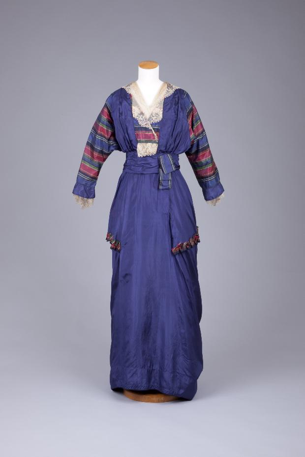
The slim skirt is a classic feature of the early teens, and disappears almost overnight at the end of 1914, when the start of WWI made shorter, fuller, easier to walk in skirts more practical. Although the skirt slims down again after 1917, it never returned to the pre-war length.
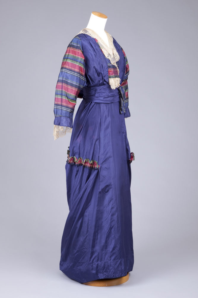
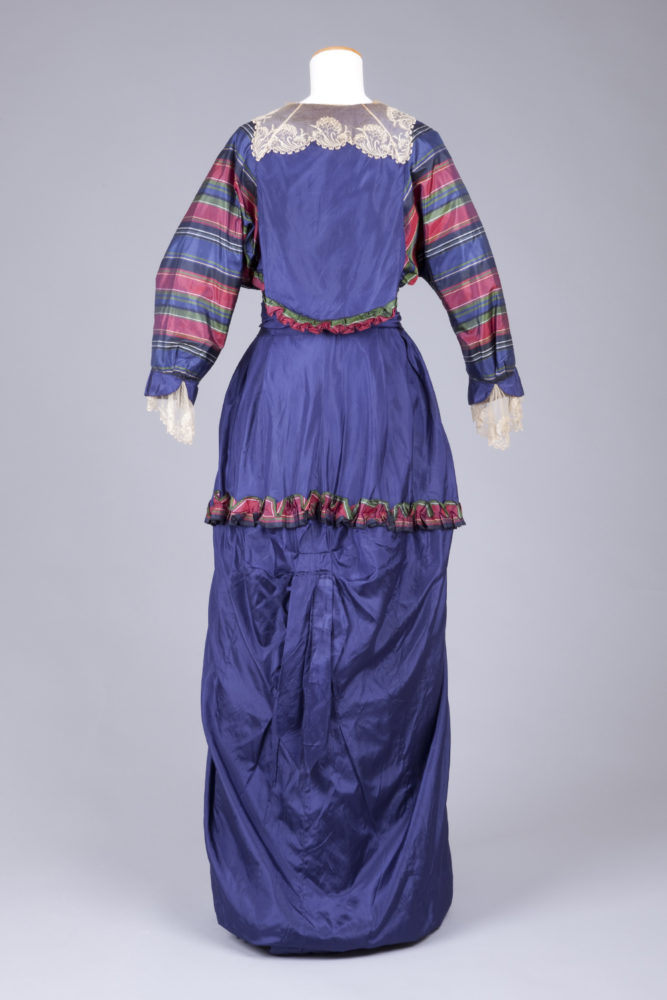
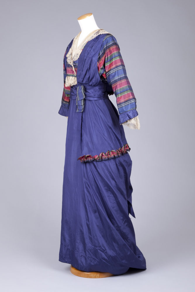
The unusual skirt trim, with the stripes arranged as a pleated ruche forming a faux tunic, and the skirt picked up in a flattened bustle effect at the back. We’ve seen similar below-the-knee bustling and draping on this ca. 1912 purple dress, this early ‘teens peach number, this pink velvet hobble skirt, this apricot chiffon and satin 1914 evening gown, this sage green 1912 evening gown, and this silver and blue 1914 frock. By the time you get to early 1915, skirts are full.
The deep sleeves, with armscyes that go all the way down to the waist, were also extremely fashionable in 1913-14, although you see similar examples as late as 1917. The designer of this dress certainly wanted to ensure that you noticed the sleeves, making them in boldly striped silk which is perfectly coordinated with the main blue of the dress.
The same silk was used to form the faux tunic, and a quirky little ruffle on the back of the bodice. The bold hues are also a classic feature of the pre-WWI years. While the early Edwardian era revelled in half-tones and pastels, designers like Poiret, and influential touring companies like the Ballet Russes, made bright colours and clashing hues fashionable.
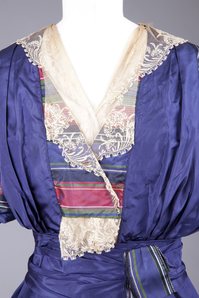
Despite the strong colours, the dress isn’t without some classic Edwardian softness. A collar of delicate lace of embroidered tulle with crenelated edgings fills the V-neck (open necks – a daring new innovation in daywear!) and plays peek-a-boo with the striped frontspiece in touch that is both evocative of 18th c fichu, and wittily modern.
What do you think? Wacky? Wonderful? Weird?
Rate the Dress on a Scale of 1 to 10
A reminder about rating — feel free to be critical if you don’t like a thing, but make sure that your comments aren’t actually insulting to those who do like a garment. Phrase criticism as your opinion, rather than a flat fact. Our different tastes are what make Rate the Dress so interesting. It’s no fun when a comment implies that anyone who doesn’t agree with it, or who would wear a garment, is totally lacking in taste.
(as usual, nothing more complicated than a .5. I also hugely appreciate it if you only do one rating, and set it on a line at the very end of your comment
I love the colors in the stripes and the main body. They are gorgeous! That all I have. I can’t say anything nice about a single other thing. 3/10
I wonder about the dating as well. Like, could have been made in 1915 for someone older who liked the earlier styles or from a place not as fashion forward?
The colors are grand. The horizontal striped sleeves remind me of a la Francaise dresses. Lots of interesting detail bits and still very 1910s. Would totally wear to a ragtime event or a fancy dinner reception (if I had the means to go to those art museum fundraiser events). 8/10
I briefly considered that it was made at a later date for a person who preferred earlier styles, but discounted it as a possibility. It’s an extremely fashion forward style for 1913-14. When you see examples of garments that have earlier elements made at later dates they are invariably a toned down, conservative take on the style they represent: not every fad from a few years back crammed on to one dress.
Trying to ignore the fact that the dress could have used a good pressing before they put it on the display mannikin….
I love the colors. That purplish blue is wonderful, and the stripes in blue, deep pink and apple green work well with it.
Unfortunately, the color scheme is the *only* thing that works with this dress, in my opinion. The draped blue overtunic effect looks bunchy and graceless, the striped ruffle on the edge of the tunic hem looks random, the gathering of the skirt in the back (and the self-ribbon hanging from it) look as though the wearer was the target for a game of “pin the tail on the donkey”, and the lace (beautiful in and of itself) looks as though it was an afterthought.
Weird can be beautiful, but this dress doesn’t strike me as weird, but actually ugly. It puts me in mind of a child with access to mother’s sewing fabrics who is playing dress-up. It beats the sea green frock with the cilia on it to which I gave a 3.5, long ago.
2.5 out of 10.
i love it—it’s one of my favourite time periods in western dress. i’m not a fan of the fichu-esque lace frill hanging out beneath the striped inset at the bodice, but everything else is fine by me. i like the lace collar and cuffs, i like the stripes, i like the slightly bold colour choices altogether, and i like the silhouette overall. i’m fine with the bits of striped fabric used as trim and accent at the waist. in fact, having taken shears to the extraneous bit of lace, and brought the striped fabric down to the waist, i would wear this.
rating: 9/10
It just seems to be a weird mishmash of colours and trim to me. I do like the fabrics though.
2/10
I agree the color combination is amazing. You mentioned “quirky” in your description. I think that is a good word for this dress. I does need a good pressing-that might help with the overall look. 5/10
I’d like it better without that blob of lace hanging down by the waistline. Actually I’d like it even better with no lace at all so you could see the neckline detail, the best part of the dress. Agree with previous comments that the little ruffles on the back look strange and the “tail” is stranger yet. The front view is far superior to the back view, in my opinion. Agree with previous comments that the fabric is gorgeous, but what a waste of gorgeous fabric!! give it a 4
The only thing I like about this dress is the pretty lace v-neck.
2/10
Oh I want to love this but I just can’t. The 1980s colour scheme, including the loud silk plaid, and the hard to understand ruching and gathering and that weird puffed horizontal ruched trim, I just don’t get it. And I always get it!! And I really quite like this era.
I think if I saw it on a person with the right accessories it might all make better sense.
5/10
I don’t like it. I know it’s partly the fault of presentation, but it looks like a poorly rolled sleeping bag. I have a vintage collar that looks like the lace, so that gives it a 3.
That is a perfect description!
My mother says it looks a bit hodge-podge, like the elements were slapped together ‘zusammengesucht’ was her actual word. She also doesn’t like the stripes, and she gives it
3/10.
The colours are beautiful and those fabrics could be used for something lovely, but the shape and overall effect reminds me of a pile of clean laundry that’s been on the couch for a week because no one wants to fold it (and not just because of the lack of ironing – if it was ironed it’d still be oddly shapeless and have unnecessary bits of fabric manipulation that swear at the bright colours and neat stripes)
And the lace belongs on a different dress altogether.
3/10 for fabric.
I love this era of clothing. This is a nice garment, I could almost do a copy. The stripes work, but not my taste. There seems to be something off, I dont know what. Could be the lace as the previous comment suggests. I wont get into the presentation, i.e. need to be pressed. It’s a beautiful garment, the fabrics are divine. The hem , always an interest of mine, is correct for the era. Overall I would give it a 7/10
First reaction is: Wow, yes, this is a great dress. Then I start scrolling down and realize that I don’t like the trim halfway down the skirt, or the bustling on the back, or the lace collar. I love the striped sleeves and bold colours, but it feels as if the designer felt that s/he had to slap on some contemporary trims and didn’t dare go without them. In all it is a solid 8/10 but it could have been so much better.
8/10
Looks like it came from a dressing up box. It could at least been presented better.
2/10
This style of dress has definitely been growing on me. That said I don’t like this particular one very much. The biggest issue for me is that I DO NOT LIKE that striped fabric. The colours are fine, it’s the actual stripes I object too. I know it’s probably because of my modern filter but those big tacky stripes paired with lace just looks wrong. It doesn’t help that the fabric is used in tent sized sleeves! Which is another thing I am not loving. Those huge sleeve holes with all that extra bunchy fabric under the arms.
If you can get over that the dress is ok. I actually think the trim they made with the striped fabric is cute. I like the general silhouette of the front too. It just looks like it needs to be neatened up a bit.
Just can’t get over the stripe pattern. Sorry! 5/10
Also I don’t have anything nice to say about the back. It looks awkward. Nuff said.
This is going to sound weird, but it looks like some teenager in a fashion behind area wanted ALL THE THINGS when the fashion magazine finally reached her town and her parents gave in. Its a hot mess, but well constructed. But overall it’s a disappointment from one of my favorite periods.( I also think it might be slightly earlier than it’s dated)
4/10
And for heavens sake if you’re going to display something hire a qualified person to make it presentable. What were they thinking?
I presume the museum was thinking that all researchers, and most other people, would prefer decently presented photos of as much of a museum’s collection as possible, rather than perfect photos of only a tiny percentage of said museum’s collection.
Staging an antique garment for photos is incredibly expensive and time consuming. I’m sure the Goldstein Museum of Design would be delighted should you wish to offer them the 10 million or so endowment that it would take to photograph all the garments in their costume collection to proper standards over the next 5 years.
Failing that, I’m just going to be extremely grateful that they have put photographs, of whatever standard, of so much of their collection online for us to enjoy. It’s an incredibly generous thing for a museum to do: you and I have no link to that museum, and can still access and appreciate their collection. 🙂
I love it! It’s such a perfect example of its era. And I agree, 1913. The lace is the perfect extra touch, and that is such a beautiful shade of blue. It is not the fault of the poor dress that it wasn’t ironed before it was put on the mannequin. Perhaps the museum staff felt it would be dangerous for the old silk to get ironed? This dress manages to be both elegant and up to the minute with fashion (assuming it is indeed from 1913), which is not always achievable. The lady who wore this really knew how to dress. 10/10.
I’ve never commented on a “Rate the Dress” before, but I had to leap in to defend this dress. The early 1910s is one of my least favourite fashion moments and I still like this! The colours are so vibrant. The big stripey sleeves and the matching ruffles are a playful touch. I even like the accent of old-fashioned lace to tone down the drama of the rest of the dress. And think of how the taffeta would rustle when you walked! This day dress wants to party and I am here for it.
9/10 ( substracting the 1 point because I still can’t quite love hobble skirts)
For me it’s the opposite. I love the 1910s but this dress is not the best example for this era.
Well, I actually like the overall shape, colours and fabric.
I’m weirded out by the belly lace, and the lace bits as a whole are fighting rest of the dress. The faux tunic effect could be cute, but in combination with the ehm… “bustle” fabric manipulation … And don’t get me started at the weird thing that’s growing out of the waist at the back.
6/10
That sums up my feelings quite well (I might add things here and there but other have also already said those), so I think I’ll just go with seconding this comment, including the rating. 🙂
I love the style, I love the colors, I love the way they match. Sure, it could be presented better, but I don’t think that really counts. I agree with everyone who pointed out the lace bit at the bottom of the neckline; very jarring & worse than unnecessary. Even though I love the way the stripes match, I think whole sleeves of them are too much. Perhaps *cuffs* on the sleeves would have been much better – as shown by the touches of color with the same accent fabric elsewhere on the dress.
7/10
Love the blue fabric and the plaid fabric. Some really interesting style elements in this dress. But the lace is all wrong – it’s too traditional and conservative for what is quite an edgy style for the day. Completely ruins it in my view.
6/10
Great color and stripes and the self-trim ruching.
Not at all fond of the lace sticking out of the front. Like a chemise someone forgot to tuck into their stomacher.
I would have preferred a collar of the striped fabric. The lace is a bit delicate for the bold strips.
My grandmother would have loved this dress.
9.0
I really love the bodice in the front because of the combination with lace. But I don’t like the back because of the silouhette and the patterned ruffle around the waist and below the hips.
I didn‘t like the bright colors and patterns on the first glance but now I somehow like it.
6/10
Love the colours…not sure about the dress…7/10
I adore this dress, I really do. It only loses a point for the weird lace that’s sticking out the front, and the effect of the bustling. Everything else I love
9/10
I have mixed feelings about the lace, if you took it off it would look too bare but nor does it really seem to work as it is. Maybe a different type/design of lace would work better though I don’t know what. I also really can’t like the the bustle thing popping out at the back of the knees. I quite like the bold sleeves and the waist tie, but as a whole the dress is not for me.
4/10
Just…no.
4/10.