
I’ve got a real soft-spot for ca. 1880’s fashion. There’s something about the combination of a fairly sleek silhouette and a ridiculous amount of trim that just tickles my fancy. It was also an era of experimentation and whimsy: silly pockets, and every type of embellishment you could imagine combined. Of course, some examples of the era pull off the ridiculousness better than others. Will this week’s Rate the Dress tickle your fancy?
Last Week: a ca. 1860 dress in stripey plaid
Mixed results on last week’s dress. Most of you liked the sleeves, although the trim was controversial. The fabric was hardly an unmitigated success: even if you liked the fabric’s colours and pattern you weren’t entirely on-board with the combination of print and cut, and thought the stripe-heavy plaid wasn’t suited to gores.
The Total: 7.3 out of 10
A rather mediocre score after the perfection of the week before.
This week: an 1880s reception gown in two parts
There’s an interesting tension to the aesthetic of this gown.
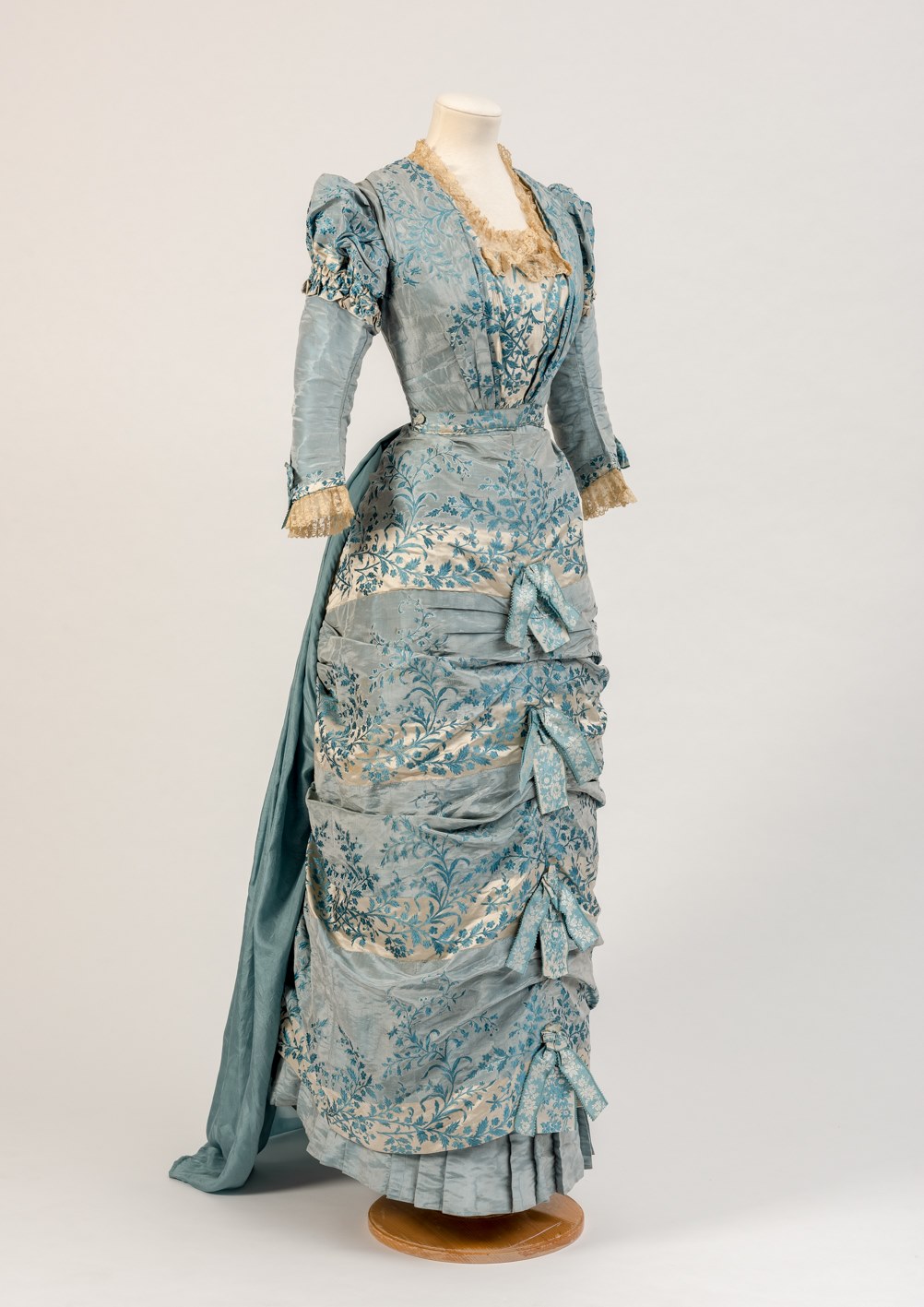
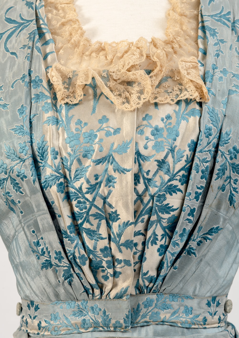
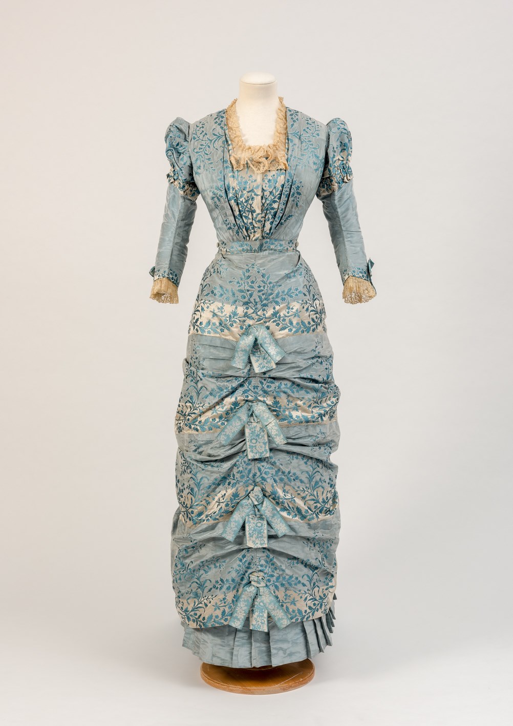
Dress in two parts, 1880s, Fashion Museum Bath
The skirt is absolutely conventionally fashionable for the early 1880s, with its pleated ruffle at the hem, front ruching, ribbon bows, and trained back. But there’s just a hint of the aesthetic movement in the bodice. It’s only a tiny suggestion, but the puffed oversleeves with their ruched cuffs, straight waist, and front gathered bodice all hint at an alternative view of fashion.
Dress in two parts, 1880s, Fashion Museum Bath
There’s some rather clever elements to this dress if you look closely. The way the stripes are used on the bodice to create the impression of a separate centre front panel. The buttons on the waistband, which may mean the train is detachable (and possibly even a later addition to the dress?). Alternatively, the buttons may be a way to fasten the bodice to the skirt. They could be part of the skirts waistband, and fasten through the bodice to hold the two parts perfectly in place.
Dress in two parts, 1880s, Fashion Museum Bath
What do you think? Is this hitting the sweet spot of ca. 1880 fashion?
Rate the Dress on a Scale of 1 to 10
A reminder about rating — feel free to be critical if you don’t like a thing, but make sure that your comments aren’t actually insulting to those who do like a garment. Phrase criticism as your opinion, rather than a flat fact. Our different tastes are what make Rate the Dress so interesting. It’s no fun when a comment implies that anyone who doesn’t agree with it, or who would wear a garment, is totally lacking in taste.
As usual, nothing more complicated than a .5. I also hugely appreciate it if you only do one rating, and set it on a line at the very end of your comment.
I like the fabric and the way the bodice pleats fan out to the corners of the neckline. That’s pretty much it. I assume the lace has discolored and therefore am not marking down for that. But I don’t like the sleeves or the trussed up look of the skirt, and I really dislike the bows, although I agree something is needed there. It just isn’t those bows for me. 4/10
Yup, I would lose the bows. Leave the gathers tho. Love the color and lace at bodice. However, don’t think I could walk in it. Lol. 7/10
My first thought was definitely not but on a second look I actually really like it (except for the bows which I think detracts from the whole look). I think it’s a really interesting dress. The colours in the dress are interesting and attractive. I like the way the pale stripes in the skirt are echoed in the bodice. I also really like the sleeves.
9/10
Love this fabric! Also the design, silhouette, gathers. No love for the bows, but those could easily be removed.
8/10
i like the fabric, and it’s a pretty colour. i think the bodice is the best of this dress; the skirt is typical of the period, but it’s not a period for which i have great love. the bows down the front of the skirt have my fingers itching for some scissors…especially on top of the ruching and ruffles. the train feels a bit unrelated; perhaps it was an addition, as you speculated. it’s certainly not the worst dress of its period, but it doesn’t move me with its charms, either.
rating: 5/10
I liked the bodice-more so after you pointed out the clever use of a single fabric
I like the sleeves they have some pizzazz
I like the pleated ruffle at the hem a lot (It appears to be a different fabric which is nice)
I don’t think the train was a later addition …it does sort of work with the sleeves
but it is awful…needs to be deleted
and the skirt…
I think the ruching might have worked a little better if the skirt were not so straight and narrow
and I hate the odd looking “bows)
4/10
I love how the fabric has been manipulated and placed on this dress to create the effect of a dress pieced together from two materials at first glance – it creates some lovely subtleties and complexities that please the eye. The Natural Form era makes for some very nicely proportioned and elegant dresses of any size, even if they do also look quite tricky to walk in due to their apparent tightness.
I’m not sure how I feel about the solid fabric bustle/train attached to the back, especially as we can’t see it to gauge how effective it is, but the front view is lovely, and it looks like the train is in a nice harmonising colour so I’ll assume there isn’t some horrible design error hiding behind there.
I give it 8.5 out of 10 for what we can see of it.
And for the record, after seeing the other comments, I LOVE the bows. They give coherence and a visual justification for the “trussed-looking” effect of the skirt that probably wouldn’t be there if they weren’t there – it would potentially look like a really wrinkly stocking all rumpled and wrinkled round a leg otherwise which I don’t think would be very attractive. The fact that they are made in the same fabric means that they subtly coordinate, and are not in-your-face – they feel essential and integral to the design, so I definitely love the bows.
I agree about the bows. I wish there was a picture showing the train properly though. I also wish they had soaked that lace in nappy wash. 9/10.
Soaking lace in napisan takes at least 50 years off its life as a structurally sound item, which is why museums don’t do it. Not to mention that removing and re-applying the lace would destroy the integrity of the garment as an ‘original’ item.
I read the comments about the bows and how distracting they are, but for me they seem necessary for collecting and balancing the gathers. I LOVE the fabric. I would never be able to wear this dress, but for a slim young woman of the era, as an afternoon dress, it makes sense. I give it an 8
7/10
I want to like this dress more than I do. I think the problem is that for my eye there are either too many layers of ruching on the skirt or not enough. It needs to start higher on the hip, at least where the lighter stripe starts, or it needs to be unruched at least to mid-knee level. I’m wondering if the first lighter stripe on the skirt is the problem. Maybe if it was a solid color, the current proportion would look correct.
I love this dress. The fabric and colour is lovely. I love the bodice. I love the sleeves. I love the train and the pleated hem. I am not in love with the ruched skirt and bows, but I’m really not sure what I’d prefer to see there instead. I know it’s very typical for it’s time period, but I’ve always found it a bit of a weird look. 9/10 for me, only 1 mark removed because of my reservations about the skirt.
I really enjoyed the lovely color…I’m a sucker for blue that has a bit of green in it. Thus, the underlying lighter blue ruffle is more satisfying to my eye than the darker teal of the train. The puffed oversleeves seem too young for the rest of the sophisticated dress.
8/10
That certainly is a very interesting dress. Like Tracy, I’m fond of ice / Alice blue. The lace trim is frothy and divine; natural form fashions are extremely attractive on the right figure. Very clever use of the fabric’s pattern, as others have noted.
However – my great-grandmother had a lovely formal living room, with brocade curtains matched to mid-20th-century faux-18th-century brocade canapes. So help me, this delightful flurry of a costume is Violet’s sofas in wearable form.
8/10
It’s beautiful, I love everything about it. 10/10
I love the floral fabric; the pattern and color are elegant without being boring. The train coordinates well with the bodice. I like the draping of the skirt and the two-piece design. The only thing I really don’t like are the row of bows down the center front. If I had bought this dress in period, I’d probably snip the bows right off.
7.5 out of 10.
To me, the top and bottom don’t quite look like the same garment–I wonder if it’s those little touches of the aesthetics movements. Somehow, I keep expecting that bodice, with those sleeves and gathered front (and WHAT a clever idea, to use the stripes to suggest a separate piece) to be attached to skirt that’s more flowing.
7/10
I had a rather odd reaction on first seeing the photo of this dress – I thought it looked like a china figurine minus the figure. I think it’s the nature of the fabric, which is lovely, and the shades of blue, which are elegant. However, the style of this era had just so much architecture – element piled on element, that it almost gives me a headache, and I find that I can’t separate my own reaction from being able to evaluate it as an exemplar of its time.
7.5 of 10.
I love the fabric, the blues are lovely, and the gathering on the front of the bodice is pretty. I just really can’t like ruched skirts, though I agree that this dress would look even odder without the bows.
6/10
The blues of this are lovely, and I tried to imagine the yellowed lace as more white, but I don’t think I totally succeeded. Maybe photoshopped versions ought to be displayed with the dresses in museums where the fabric is visibly aged? That would be fun.
The stripe to the fabric didn’t sit all that well with me, but the trim was fun. I thought they looked like little sweaters, or something. Not a choice I’d make quite that way; I’m more partial to more horizontal trims than the centered vertical thing going on here.
I really love the shape of the dress overall. Those sleeve caps!!
8.5/10
There is much to like about this dress, even though I am not an especial fan of this era. The color, the cunning front panel, (although I personally find the horizontal color changes in the skirt to be a bit ungainly) The ruched skirt over the bottom pleats would be very ala mode for the time.
But the bows just cry out to match the darker color in the fabric and be a solid color (velvet perhaps?) rather than another pattern competing with the fabric of the dress. That takes it from potentially elegant to overdone in my eye. I would also remove the frou-frou sleeve caps and can envision the gown with a plain sleeve. As it, there is just far too much going on to be elegant for me. 6/10
I’ve read the comments and keep noticing some little detail that had missed during the viewing of the pictures… I love the fabric, the matching of the tone on tone of strips and the embroidery. I think the horizontal strips do remind more of flowy skirts but an 1880 lady doesn’t like to give long steps I wish we had some pictures of the back, I love the tiny train. 9,5/10 would wear it
I really like it. It seems very in tune with the fashion of the time and, for me, there is a lot of pretty. I love the colour, amount of pattern, and the ‘fancy bits.’ 9/10
The colors and print are so lovely, but…I can’t love it. I think the bows are the “solution” to the “problem” of what to do with the front gathers, which would look strange without the bows. But then I’d prefer not to have the “problem” of the gathers and horizontal stripes mixed together at all. I’m not sure the oversleeves tie in with the rest of the dress. With sadness for that gorgeous fabric, I give it a 6.
I’ve never been a great fan of what I find to be the rather overdone, over-stuffed and cluttered late Victorian aesthetic (both in interior design and in costume, not to mention architecture), but it’s hard not to appreciate the clever design creativity and construction that went into this gown.
The colours of this gown are also soothingly apart from many of the vivid, even garish hues so favoured in the 1880’s, especially for a reception gown. The bows, in my view, are absolutely a required element to balance the design visually, as are the touches of ecru lace which add delicacy and help to offset too much blue. Incidentally, this colour combination — pale blue and ecru or ivory — was the iconic pairing of the early Edwardian period.
Overall however I find there is something just a little incoherent about this gown’s construction. My guess is that it may once have had a separate ball bodice, or possibly (and perhaps even more likely) the existing bodice was re-made from the original ball bodice. This might account for the puffed-over-straight sleeves, the unusual gathered centre front, and the very odd waistline closure. What I see, rather than an attempt at hints of aesthetic dress, is a ball bodice transformed, with the use of some remnants of the original gown’s silk and lace, into a more practical reception gown. One could even speculate that perhaps the owner went fairly quickly from a single debutante to a married woman with more use for reception gowns than ball gowns. Or that the colour and/or textile was no longer of the highest fashion for formal balls. But then I particularly love to make up stories about intriguing antique gowns!
As shown (and given that the 1880’s isn’t my favourite era): 7/10
Just wonderful. I love the blue, and the way the stripes are worked into the design is just marvellous. The poofy shoulders look a bitt odd, so no perfect 10 because of those.
9.5/10
I love the dress; I think it is a perfect example of upscale dress for that era. Unlike most of the posts, yes, I like the bows; that too was the style of the times.
I rate the dress a 10.