Apologies for the late Rate the Dress. But, the late post means I found an dress I’d entirely forgotten about in my inspiration file, and it’s so fabulously fascinating I’m hoping it makes up for a late post!
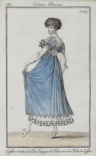
Last Week: an Empire era spencer & petticoat
I’m not usually a brown fan, but I’m obsessed with the particular ochre shade of last week’s spencer, but alas, many of you do not share my love. And even those who loved the spencer weren’t sure about it paired with the frilly petticoat – though you liked each garment on its own merits. However, I’m afraid I may have cheated the score every so slightly by showing that interior view, because I suspect some of the costume nerds among you were so charmed by the details you gave the outfit a higher score for it!
The Total: 7.9 out of 10
An improvement on the week before, but hardly brilliant.
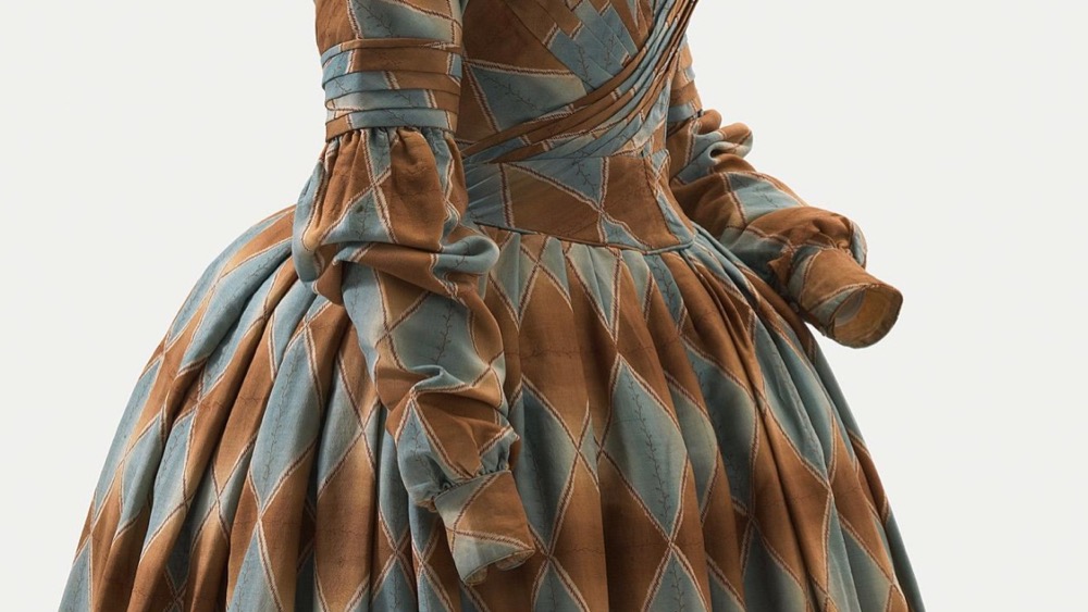
This week: an 1840 dress in harlequin pattern
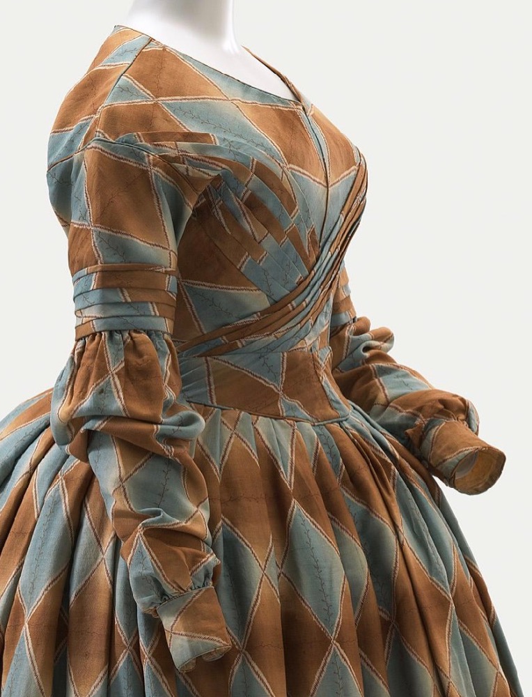
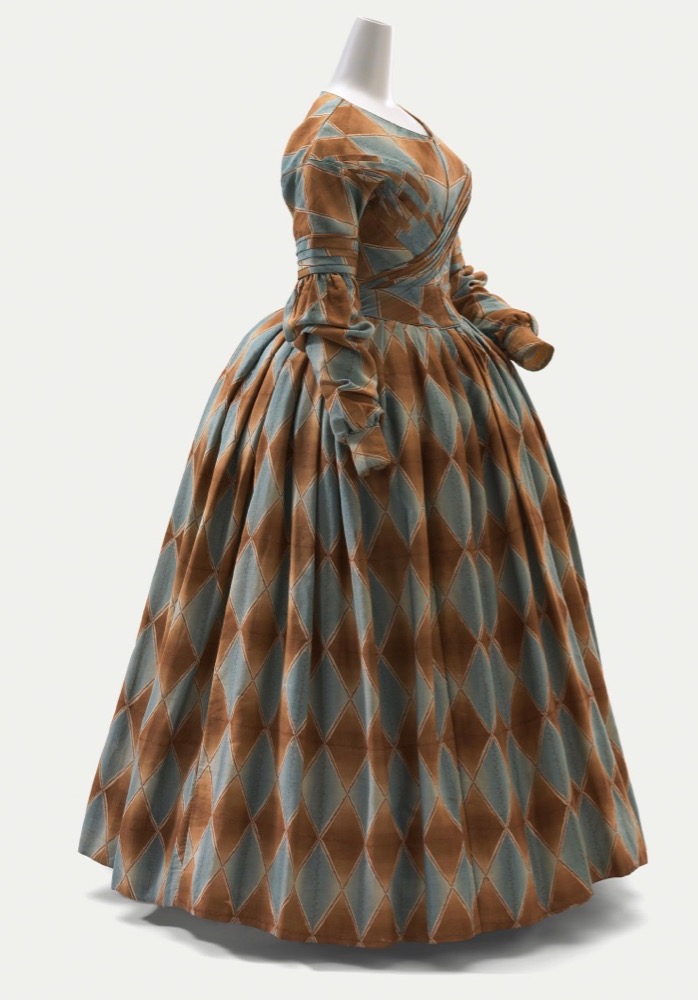
This week’s Rate the Dress carries on my love for rust-y, ochre-y hues, this time paired with a blue-grey. It also carries on the blend of simplicity and frivolity seen in last week’s outfit, although here the order and the whimsy are spread evenly across the dress.
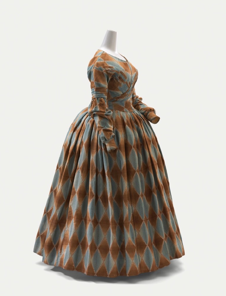
Purchased through The Art Foundation of Victoria with the assistance of David Syme & Co. Limited, Fellow, 1977
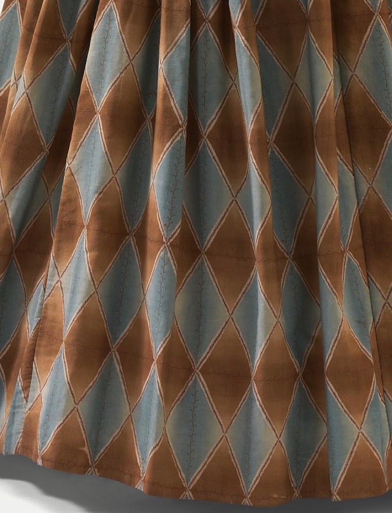
The whimsy is easy to see: the entire dress is made in harlequin patterned fabric (wool or silk or a blend of the two, according the catalogue record), albeit in a very restrained colour scheme. Note the very delicate vine pattern running through the centre of each blue-grey diamond.
Purchased through The Art Foundation of Victoria with the assistance of David Syme & Co. Limited, Fellow, 1977
The cut is also 1830s ridiculousness moving into 1840s restraint. The sleeves retain a bit of detailing and the last of the Romantic era poof. The elaborate bodice decorations so often seen in the 1830s have resolved into subdued pleating wrapping across the front of the bodice.
Purchased through The Art Foundation of Victoria with the assistance of David Syme & Co. Limited, Fellow, 1977
It’s a perfect example of one era merging in to the next, all done in a memorable fabric.
Purchased through The Art Foundation of Victoria with the assistance of David Syme & Co. Limited, Fellow, 1977
Of course, a perfect example does not necessarily mean something is perfectly elegant. How do you feel about large scale harlequin print and Romantic heads towards Gothic details?
Rate the Dress on a Scale of 1 to 10
A reminder about rating — feel free to be critical if you don’t like a thing, but make sure that your comments aren’t actually insulting to those who do like a garment. Phrase criticism as your opinion, rather than a flat fact. Our different tastes are what make Rate the Dress so interesting. It’s no fun when a comment implies that anyone who doesn’t agree with it, or who would wear a garment, is totally lacking in taste.
(as usual, nothing more complicated than a .5. I also hugely appreciate it if you only do one rating, and set it on a line at the very end of your comment