
Your reaction to last week’s blue & grey 1920s ensemble depended hugely on whether you like the 1920s or not. There were a lot of 10s, and a lot of 2s and not a lot in between. They balanced out at 7.4 out of 10 (because there were slightly more 10s), but in some ways I think the outfit was far more successful than that, just for being such a simple collection of pieces which provoked such a strong response. (and thanks Carol for giving the ensemble a face to go with it!)
I do apologies for the slight lateness of this post. I was exhausted last night and decided that if something had to go, it was blogging. So slightly delayed, here is this week’s dress, chosen because it is the complete opposite to last weeks practical, restrained, über-modern sporting ensemble.
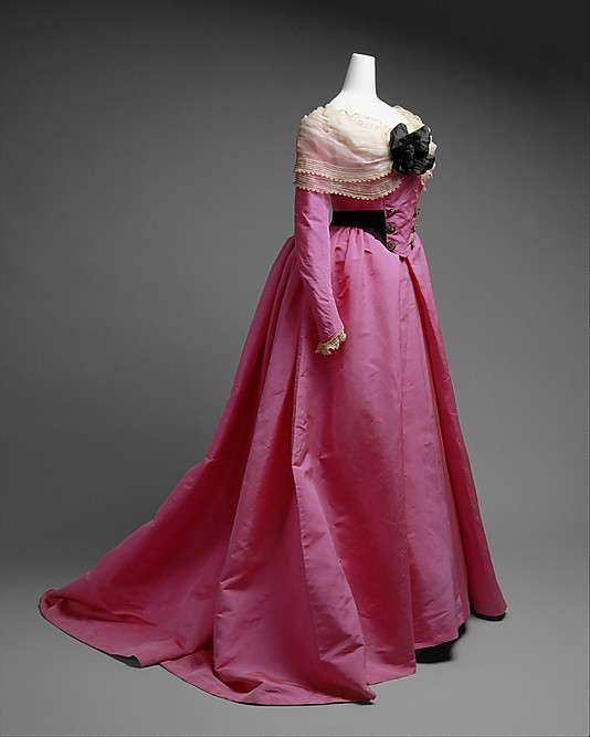
This Worth frock is frivolous, decadent, utterly feminine, and unabashedly historical: liberally borrowing from 1780s and 90s fashions for it’s inspiration. The late Georgian influence is so literal (the open skirt, the straight front with double-breasted buttons, the black sash, fichu, and bum-rump) that I sometimes wonder if the gown wasn’t designed as fancy dress. And yet, so many of those elements of the 18th century were also the height of fashion at the turn of the 20th century. The open skirt, faux or real, is a common feature of gowns from the 1880s onwards. The straight front was just coming into vogue with the S-bend corset. The fichu echoes the high puffed sleeves so popular in the late 1890s. For all that, the gown is far more of a look backwards than a snapshot of the height of 1900s mode.
What do you think? Do you like the simplicity of line paired with the slightly over the top colour? The nod (well, more a full on bow) to the 18th century? Or is the whole thing too obvious in its aesthetic, and too obviously in its inspiration?
Rate the Dress on a Scale of 1 to 10
I wish there was a full frontal view of the dress; it makes it hard to judge how the bodice is styled.
Yet, overall, I rather like it. It has a very late 18th century vibe, as you’ve said, but I like the colors involved and the proportions, and I generally prefer dresses where the ornamentation is tasteful and restrained. I’m not sure I would have worn it for anything *other* than fancy dress, in 1900, but I think it’s pretty enough that I can’t mark it down too far for that. An 8.5.
Rating this? Well, my partner and I were just talking this morning about my 99%-of-the-time dislike of pink. I can’t fault this dress for its pure lines, only for its use of color, so I’ll give it a middle of the road 6.
And I bumped it up a full point because it’s so evocative of a Colette character from her “Claudine” book series – the voluptuous Marthe, who, in the late 1890s, dresses to flatter her curves and stand out in fashionable Paris with clothes that evoke the 18th century. Marthe wears pastel colors, fichus, and bergere hats, and is constantly being compared to a Fragonard painting. Alas, Marthe’s behavior is as far away from a Fragonard maiden as you can get…
Fragonard ‘maidens’? Well, in a manner of speaking… What exactly do you think is happening in The Swing? 😉
I get the sense that the Fragonard – let’s try damsels – are at least doing what they do for love!
Quite pretty as a fancy dress, I think, and if it were that I would give it 8/10. However, as a regular piece of dress I do think it’s a little obvious (the color doesn’t bother me, though, in this case). So… 5/10.
Best,
Quinn
Whenever I first saw it, I thought it was 18th century, but then I realized the color was way too “shocking” for 18th century. I love the late 1700’s, so I really like this dress. The pink and black are shocking, while the lace trim and fichu tone it down just enough!
9 out of 10
Since this is one of my top ten favorite dresses EVER, I give it a 10. One of these days I’m doing a recreation of this. It is pure splendour.
House of Worth? What the? Surely not! I guess my initial reaction means that I don’t like this one; that neckline detail is a disaster. Probably worn by a Mary Crawford character.
1/10
I’ve also loved this dress for years, so I also give it a 10! (and also fantasize about re-creating it for myself)
The lines are pleasing, the fichu really helps, and while I’m not a pink person, this isn’t the worst pink I’ve seen. And who am I to carp at fancy dress?
But I have some issues with the frontage. The panel with the double row of buttons can’t decide if it is a proper inserted front piece or a bit off a military uniform. It’s buttoned on top. The buttons are too big and heavy, too – not right for the fabric. Why didn’t you use fake lacing, Mr Worth? I am a little meh about the black waistband, but I am definitely against the BIG black bow on the bosom. Too heavy for the fichu, and too black. Put that dress on someone in an S-shaped corset, and it’s going to be like a menacing yet girly figurehead.
7 out of 10 – because I think a couple of quick and fairly easy changes could improve the dress no end.
What Lynne said. 7/10.
The barmaid lacing is pure ick. I’m not a pink fan nor a fan of trains.
A 4.
I’m not a fan of pink, I really hate the barmaid lacing and I don’t like trains.
4
Although I am not a person who would wear aggressive pink, for the person who can pull the color off, this is a splendid example. The sheer brio of the color is controlled by the well-defined lines and the puncuation of the black and somewhat softened by the fichu, both in color and graceful drape.
I’m sure it was never intended as any regular day wear, but as a conversation starter at some evening event (opera? ball?) or a fête champêtre, it would have been outstanding.
9 of 10
I should like this dress, it’s clearly inspired by one of my favorite fashion decades, I usually like pink. Still I think the colour is too strong, and I’m not a fan of the 1900 straight front. The fichu and the bow is adorable, but still I can’t give it more than 6.
IMHO a dress can never be too pink so I definitely don’t mind the color. I don’t like the black flower though and I am not sure about the black sash. I think it might have been prettier to keep it pink and white only. I’d rate it with 8.
It does look like it was made for a fancy dress. I was just reading up on the costume balls that Louis Comfort Tiffany would bung on in New York.
Would we call that ‘drunk tank pink’? I like the draping of the fichu and the draping of the skirt.
Catch a lamb, give me a crook, and I’ll wear it. *vbg*
7/10
If it was black, it would be quite Puritan in appearance (apart from the train). In pink, it’s a bit too strawberry milkshake for my tastes. Is there no happy medium between black and pink?
5 because it could be quite nice in another colour.
Pink is my least favorite color, the large black bow is too much and I don’t really care for the the whole neckline-shoulder mess. But if it was the only thing I had to wear or go neked, I guess pink would be my color. 4/10
Luann.
*grabby hands* I love the lines, the color, and the overall look of the dress. 10 out of 10.
My hapennorth? Fancy dress. Definitely. No doubt whatsoever in my mind. That’s a Gainsborough Lady costume right there. All it needs is a Gainsborough hat with feathers galore. For me, those long straight sleeves, fichu notwithstanding, are so VERY unfashionable for the 1890s/early 1900s that I am convinced it is a fancy dress costume. Plus, IMO, the bodice front would be a bit more draped/pouchy/arranged, not so literally flat fronted.
Although not a colour I would personally pick, I love the punchy, unabashed pink – it’s bold – and I LOVE the simplicity of the lines, the zing of the white fichu and black bosom bow, the elegant understatement of the buttons and lacing on the bodice front. So restrained and elegant. 8/10, as it’s not a complete WOW, but I like it anyway.
I think the actual 18th century lines are so ingrained in my subconsciousness that I would like it better if it followed them more closely. Like a historical recreation with a modern fabric these days, or something.
I think my problem with it is the buttons in the front together with what looks like only half of a sash. That fact that neither of those elements is “functional”. I have this dislike for buttons used (only) as embelishment.
But considering that’s my bias, I’ll go with 8/10, because the overall lines are lovely and that hot pink is fabulous in this fairly simple style, and works surprisingly well paired with that soft lace.
I’m sorry to say that to me, the dress looks a bit boring and “safe”. Even the pink looks boring, there’s so much of it and no variety at all. I don’t know who this dress was for, but the flat front suggests it was for a stoutish matron rather than a voluptuous sylph or whatever they were called at that point. So no outrageous curves at all. And that ridiculous black bow. And that boring bit of white fabric for that little bit of extra boringness.
Very meh.
And…House of Worth? Seriously??
1/10
The late Georgian is one of my favourite fashion periods — Thank you for the reference to Gainsborough! Because of this, I’ve swept many things under the rug LOL. 10/10
Hmmm…not sure what to think of it. At first glance, I thought it was an older dress, and thought it rather lovely, but when I saw that it was from 1900, it began to seem a bit costumey to me, especially because of the bright pink color. Then again, the pink/cream/black combination doesn’t look too bad. However, the black belt with the buttons on the front clashes with the lacy-ness of the fichu and bow. In fact, it just doesn’t seem to go with the dress.
Overall: It’s costumey and like you said, it seems a bit too obvious in its aesthetic and inspiration.
6.5/10
Yay, 18th century design elements! Eww, pink satin.
I think this works out to a 6.
No need to apologise. Life is like that sometimes.
As to the dress, I like it, but I don’t love it. The colour is okay as a picture on the computer monitor, but as a life-sized dress I think it would be a bit much. I’m not completely sure about the lace cuffs or the black bow on the front either. Generally, I do like the ways it references the 18th century and I think it’s quite elegant, so 7/10.
Don’t like at all!
That big black center bow/flower/ornament thingy combined with the shawl/fichu imitation and the bavarian button dirndl lookalike.
Just too much! Dirndl and fichu just don’t go together.
3/10
I don’t know how a dress in such an insane colour can manage to be so boring, but here we are. It’s just a wall of pink with a couple of random trim bits stuck to the front. Community Theatre, anyone? I can’t believe this is a Worth. 1, because I like the pleats on the skirt.
It reminds me a lot of the lady dolls we used to get when I was a child (or rather coveted but really never got) that stood on a music box, which rotated as it played. Something about the skinny arms, the bright colour, and the lace fichu collar.
It’s interesting. But it feels like it isn’t really the best of either era. But taking away all of that and just enjoying it as a dress, I’d give it a 7.
Dear Dress, Get. In. My. Closet!!!!! 10 out of 10!!!
I think it needs some more decoration to balance the lace and bow on the bodice, though if you did that it would be more formal/showy. I love the shocking pink and black but I don’t think it works with the off white lace. The lace just doesn’t seem suitable for daywear. 7/10