
Last week I showed you an evening gown worn my Marjorie Merriweather Post, in muted shades of blue and green. Ratings were divided into those of you who thought it was the epitome of muted elegance, those of you who thought it pretty, but not a stand-out dress, and those of you who found all the soft half-tones too dull and drab, and gave it very poor ratings indeed (and one vote that I disqualified for not rating on a scale of 1 to 10, because that’s cheating 😉 ) .
I’m halfway through tallying the ratings, but it’s bedtime, so I’ll finish those up first thing tomorrow!
UPDATE: MMP’s 1910ish evening dress came out at 8.1 out of 10, which seems like the perfect rating for restrained rather than sensational elegance.
This dinner dress from the Metropolitan Museum of Art features a design feature that has always been slightly problematic for you raters: a laced front bodice.
While you can choose to dislike the feature in and of itself, I am 99.8% sure that the original lacing cord has disappeared, and the one shown is a replacement, so please, dear readers, do not mark the dress down for the specific cord itself!

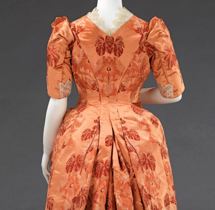
This dress features a classic 188os fabric: a sumptuous brocaded silk in a rich colour, with a large, striking pattern with a single theme: this time of hollyhocks. The rich persimmon orange tones of the dress are slightly unusual, but the overall tonality is absolutely typical of the period.
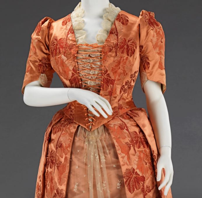
Also typical is the pairing of the heavy silk with a very light, delicate lace overlay.
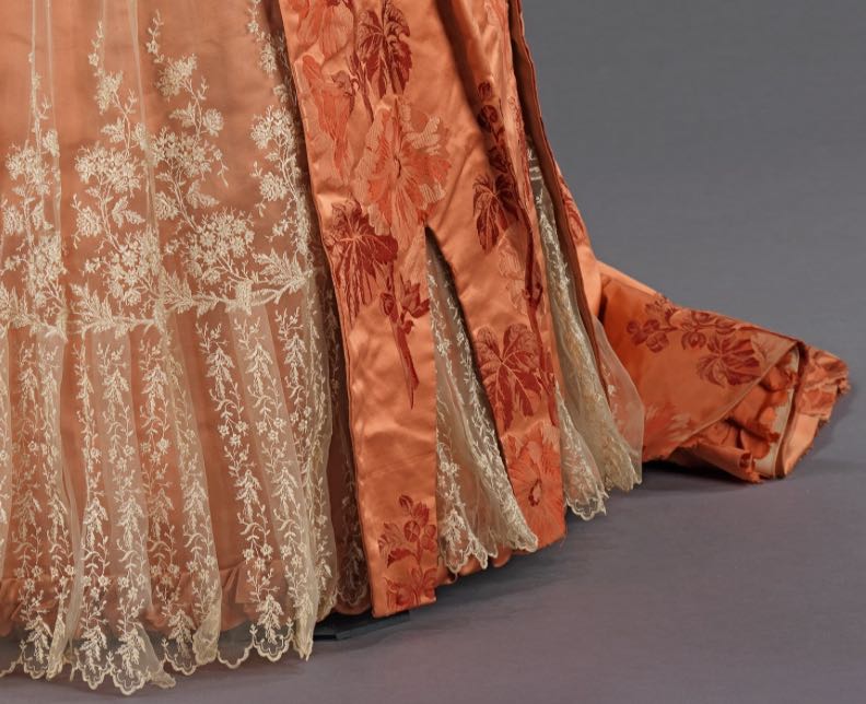
The lace both hides a plain persimmon underskirt, and is hidden in turn by the brocaded overskirt, which features hem slits which allow the lace to reveal itself again. The whole effect adds to the tension between the heavier and lighter fabrics, and to the slightly historically inspired feel of the dress.
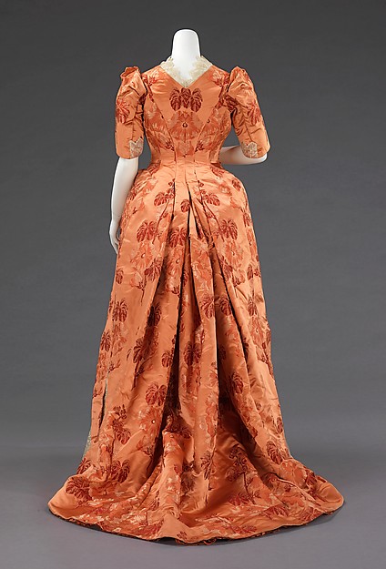
At the back, the hollyhock fabric takes centre stage, mirroring itself at the centre back, and carefully arranged in the pleats of the train, so that a flower appears at each fold.
What do you think? A masterful mix of fabric and usage of pattern? Or a waste of good fabrics? Or are the fabrics themselves to blame for any fault in the dress?
Rate the Dress on a Scale of 1 to 10.
I very much like the color of the brocade and the pairing with the ecru lace and have much admiration for how well the brocade pattern was arranged (having dinged other rated dresses for sloppy motif placement).
I am charmed by the skirt detail of the lace godets. It’s like a subtle form of flirtation, luring the beholder into thinking there might be a flash of ankle to be seen (thinking of the movie The Wrong Box).
The sleeve heads are slightly off-putting, as if there’s a missing “stuffing” to give them a better shape.
The laced front makes me sigh in disappointment, however, and it has nothing to do with the composition of the lacing itself. Unless the lacing is accomplished with exquisite regularity, one can be left with an impression of bulges, where either no bulges exist, or bulges do exist, and one wants to draw attention AWAY from them.
8.5 for being generally stunning.
Excellent, we’re allowed to mark it down for the lacing. I’m not going to mark it down for the bodice being weirdly asymmetrical, because I’ll give the dress the benefit of the doubt and say that perhaps the mannequin isn’t the right shape for it, and for similar reasons I’m not going to mark it down for those weird sleeve heads, because that might be because they’ve collapsed with age. I am going to mark it down for wasting beautiful lace, and for those weird hem slits. 4/10, well done for trying.
I like it. There’s a trim, tidy effect when all the details point inward (like the lace at the neck, the laced bodice, the sleeve caps); I’m not always in the mood for trim and tidy, but it does have its charm. The persimmon brocade is lovely and the pattern-matching well handled. My only quibble is the half-lace cuff being on the inside of the arm… that doesn’t make sense, since that’s where it’ll get worn and tattered from rubbing the dress. And why not show that lace on the outside of the arm? I like the cut-away bits at the hem…. the lace is beautiful, and the cutaways unusual but not badly done.
9/10.
The rear view of the gown is divine, and I rather like the laced-front bodice. I also like the bright orange hue (though it’s not one I would wear). The peek-a-boo slits in the damask near the hem do not impress me, but neither will I give the dress a lesser grade because of them.
On the other hand, I’m inclined to downgrade the gown for its juxtaposition of the delicate blonde lace and bold, tonal damask print. Though such a juxtaposition may well be a period feature, it’s one that I think somehow cheapens the look of the gown. I also think that there should have been a ruffle at the bottom of the elbow-length sleeves like the ruffle around the neckline–the sleeves seem oddly unfinished without one. A 7 from me.
This one has so many obvious head nods toward the Georgian Era that it is hard to count ;-). I do like the persimmon silk and lace together; however, the Georgians liked to have their lacings covered, so I will mark it down a bit for that. Otherwise, this is a beautiful dress.
My rating: 8.5/10
No problem with the laced front as far as I’m concerned. And that brocade. Eeek. That’s gorgeous. The print, the color. It’s delicious. The lace itself is lovely – light and organic and very striking over the orange. Also yay for slightly puffed elbow-length sleeves. Also the shape of the waist and the slightly built-up hips.
The lace on top feels chunky and overstuffed. The lace insets on the insides of the sleeves are also a little baffling. As for the notches in the skirt, I like the idea of the lace visually interspersed with the brocade, but it looks stiff and awkward here. The dress looks like it would be pretty stiff regardless, but having those static chunks of brocade over the floaty lace feels discordant.
So while it does feel a little stiff and dowdy to me, I do really love that color and the basic style.
7.5.10
8/10 First..this is a beautiful dress. It is artfully executed and I like the hem slits with the lovely delicate lace peeping out. I do love the scalloped lace at the neckline and the way the bodice fits. The lacing is ok, but I still seem to be looking for buttons, given the time frame. The back is just beautifully graceful. I am a bit put off by the sleeves, and must say that that is an issue of personal taste. I just don’t like this style of sleeve. The the fabric and color of this dress is stunning and would be wonderful on the person with the right coloring.
The color of this dress is lovely, not right for every skin tone for sure, but still beautiful. The only thing I think would have improved it would be full length sleeves. For me that one aspect seems out of balance. No vote, just my opinion. Thanks for sharing these weekly, I enjoy them all.
The lacing is the least of this frock’s problems! Not only a waste of the fabric, but a waste of the lace overlay. Can I give a particular mention to those sleeveheads?
1/10
…Why is there lace only on the inner arm of the sleeve and not the outer?
Now that that is out of my system – it’s okay. I love the skirt; the lace overlay for the front and the dagged hem look nice to my eye. I do like the center back view as well but, as others have pointed out, there is something off about those sleeves. And not just the lace issue which certainly doesn’t help them at all. They look like an after thought and not like they belong with the rest of the dress. Honestly, the dress would make an amazing ball gown style bustle gown if you got rid of the sleeves.
As is, 7 out of 10.
Love it. The color really does it for me, although, it looks like a deeper orange on my phone than it does on my laptop. Either way, its a lovely shade. The cut-outs in the skirt and the front lacing of the bodice look Renaissance-y (?). Its a playful romantic costume and elegant dress all at the same time.
I like everything about it, except perhaps the sleeves. I’m not sure I like the sleeves, but then again, I think anything else might have made the dress too serious.
8/10
Wow. My eyes kept sliding around trying to process the 18th C esque bits, and this was annoying me until I imagined this dress with long satin gloves and a massive hair up with ostrich feathers, and I got my eye in again to the right era. Although it is not quite so elaborate as to possibly warrant the ostrich feathers, the nude arms and hands seem wrong somehow, and the gloves would balance the visual and actual weight of the fabric. I also suspect the original wearer was somewhat fluffier than the model, whose arms are abnormally slender compared with the clearly padded body. It’s a trifle “uncanny valley”.
I like the way the Vs cut into the hem get longer towards the back. I love the fabric, and the lace in their own rights and can appreciate the aesthetic that has them be together.
I do not like the lacing but I can see how the original designer or owner was thinking. I am also fascinated by the cut of the sleeve, how that pouf on the crown is cut. good to know for Jaeger look garments in the future.
Being old enough to associate autumn tones and leaves with dusty old armchairs, I struggle with the various references this throws at me, but trying to look at it without prejudice, I would give it an 8.
For its time an unusual colour. It has hints of the passion for ‘fancy dress’ prevalent at the time. A bit of a hodge-podge of bits from here and there, but it actually makes quite a decent ‘whole’. That lacing – if it’s original they should have replaced it with a longer piece as near original as possible. Very skimpy. I have seen 2 dresses with lacing like this – one with ribbon, one with a thicker cord. Both started lacing at the top and finished with a very neat bow at the waist – a much better look. There’s something wrong with the staging of the back pleats – someone needs to put their hand inside and make them more evenly distributed.
Out of 10 – I give it a 7.
I just can’t make myself like it, I can’t put my finger on why though the laced front is part of it as are the sleeves with that silly bit of lace on the inside. The lace on the front seems really odd being behind the lacing.
2/10
Despite of the ugly laced front I quite like it. The dim orange color doesn’t blind our eyes, the brocade floral print’s match-tailoring is great at the back! Only the lace’s tiny motifs don’t match with the brocade’s big motifs, it should had been sorted out more properly, but anyways nice dinner dress. 8/10
I appreciate the homage to the 18th century anglaise en fourreau but at nearly every point it gets the homage wrong (too short sleeves/missing lace ruffles (although perhaps they simply went missing), the weird sleeve heads, the slashed skirt, the lacing, the lacing going too high) the gown looks wrong. Not because it fails to be an 18th Century anglaise but it fails to look like its parts belong together. The back view with the deep folds coming from the back is incredible beautiful though. 8/10
Reminds me of a dressing-gown gone wrong. A persimmon identity crisis!
4/10 for the pretty lace and colour.
It’s…. nice. Very unexceptionable. Not mad on the colour but it’s a nice deep rich colour without being too heavy, and nicely used. The lace goes well with it. The Princess back is lovely. But ultimately I find myself a bit bored. The sleeves are a bit nothing, and the dress itself is kind of forgettable. 6/10 because there’s nothing to really take against, other than a lack of real impact.
I just…blah. I really like the colour and the back view, and the skirt lace is very pretty. But I’m not a huge fan of the brocade. Or the neck treatment. 6/10
Love the fabric, and I even like the front lacing. But the weird bunching (smocking?) of the lace right at the top of the skirt is ugly. The lace itself is great, and that is some masterful pleating on the back, but the sleeve caps are trying too hard. And the lace only on the inner arm of the sleeve feels like an afterthought. Like they were planning on putting it around the sleeve and ran out.
8/10
I like a lot of it, although it also reminds me of a dressing gown or something like that. And it puts me in mind of BrožÃk’s Lady in Pink, somehow, in the overall slightly historical sensibility. And just like her, I think I’m going to rate it 8/10: really nice, but not quite great enough.
I adore this dress – the fabric is beautiful, very flattering, too. Elegant yet substantial if you know what I mean.
Then the dress is obviously flattering for Mrs. Mature Fuller Figure, which I appreciate a lot after so many sylph-like dresses in the past weeks (not your fault, Leimomi, of course!). So another bonus!
Then there is this slightly unexpected – 18th-century-rustic-milkmaid-meets-dinner-party-hint with the lace panels and the lacing and the strange lace thingy at the throat. A bit of “Sound of Music”, how nice! And yet it manages to be one harmonious outfit I would put on in a second, if only I could a) fit it over my 36-weeks-of-pregnancy bump and b) put ANYTHING on in a second. Even putting on a bikini means a major struggle, so I would have to admit defeat and stay in my boudoir all by my lonely self instead of wowing the dinner party/fellow milk maids an swains. 🙂
Oh, 9.5 out of 10 for the strange lacy thing.
I have been thinking for day what it reminds me of, and now I know: the early years of Diana, Princess of Wales – brilliant fabric and a hint of tackiness and in the background a sense of fun with bad taste.
I love the fabric and the colour, and I like the way they’ve used lace as a contrast. I also like the skirt and the back of the bodice – very nice use of that stunning fabric. I’m not entirely sold on the front lacing thing, but I don’t hate it and since everything else is so beautiful I’m giving the dress 9/10.
I have to admit, I like it! The beautiful large brocade design paired with the elegant detailed lace, the color, the fabric, the back pleating are wonderful! It does feel like the dress is missing a bit of itself: like the original lacing is gone and replaced by a smaller, inferior version. And I can’t help thinking that sleeve lace inserts also were lost to time, along with a solid color matching underbodice perhaps? And clearly made for a large busted mature woman, a better corset support fit would help. All that would better finish the look for me.
But despite that, and the odd sleeve tops (ugh, not a great poof), the skirt slits are interestingly done, overall I really like it!! 7.5 out of 10!
Not my favorite color but probably looks great on the original wearer. The lace on the sleeve is odd. I would either omit or put it all the way around. Once I factor in the mannequin, I like the bodice. I’d wear this in a different color. 8/10.
I like this dress. The color isn’t one I’d choose, and it is a bit odd. Having said that, I’m going to assume it worked well for the wearer. Persimmon orange seems a bit of an odd choice for hollyhock brocade, but there you have it. I’m also going to assume that any wonky-looking bits, like the sleeve caps, are the fault of display and not construction. I don’t mind the lace-up front at all. I love the mirrored cut of the bodice and skirt back. Overall, it’s a nice gown – nothing spectacular, but completely spot on for the 1880’s. I agree with MrsC – when I “imagined this dress with long satin gloves and a massive hair up with ostrich feathers” it is completely right, even if it’s not necessarily a stunner.
9/10
If Joan Holloway from “mad men” ( played by Christina Hendricks) would have lived 80 earlier she’d look fabulous in this ( this is her in the 1960s: http://noelleodesigns.com/wp-content/uploads/2013/04/madmen-joan.jpg.). The walls of her boudoir would probably match this gorgeous colour and very likely she’d have the perfect lip stick to go with it. With this image in mind: 9/10