
I’m always surprised by what does and what doesn’t come under criticism with a Rate the Dress. I knew the print and non-symetrical matching of last week’s credited-as-1860s-almost-certainly-early-1850s-instead frock wouldn’t be everyone’s favourite, but it didn’t occur to me that quite a few of you would castigate it for the anatomy it was meant to fit over. The lady who wore it couldn’t help her very long torsos and slope-y shoulders (and the shoulders, at least, were very fashionable at the time)! Many of you did, however, appreciated the pairing of a very busy fabric with a very simple design, which helped to give the dress a modest but respectable 7 out of 10.
This frock, from the Hillwood Estate Museum, features very muted fabrics, and the transitional silhouette of 1909ish, as fashions moved from the sweeping skirts and drooping bodices of the first decade of the 20th century, to the raised waists and slim columnar shape of the second.
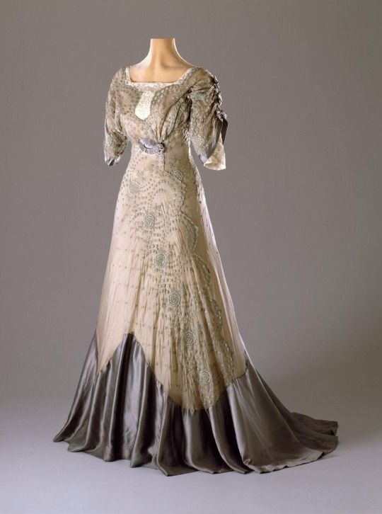
This evening dress still features the sweeping skirts, but they are considerably restrained. The colours are the fashionable pastels of the 1900s, given a slightly off-tone twist that anticipates the wilder colours of the 1910s. A slight hint of blousing in the bodice remains, but the waist is raised, and the sleeves hint at the newly fashionable kimono or dolman sleeves, albeit with a very uber-feminine Edwardian touch of bows.
How do you feel about the mix of styles? Is it the best of both eras?
Rate the Dress on a Scale of 1 to 10
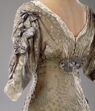
The closeup views leaves a rather startling impression of nudity, which is slightly distracting, but I suspect that in actuality that is less apparent
Overall I find it quite elegant, and although “greige” is not a color I would ever wear, for the right complexion/hair color combo it would be quite lovely in a sophisticated way, and I love the shape of the skirt.
The only quibbles I have for a wearer of any complexion is that I find the front neckline odd (as if the pale cream under-piece were something that were grabbed at the last minute when it became apparent that the neckline was much too low) and I find the sleeve bows sloppy (I would prefer using the same ruched oval ornament at the center front and back in a slightly smaller size where the bows are placed on the sleeves).
Oops, forgot to score — 8.5 of 10
I like the colour scheme for this gown very much – soft and subtle. Unlike Cyranetta, I think the addition of the lace neckline pairs well with the lace undersleeves, and would have given a delicate look against the wearer’s skin, although I’m with her on the bows – rosettes would. I think, have been better. 9/10
Elegant transition from the pouter pigeon silhouette to the ubstructured bosom of the later 1900 teens. The asymetrical contrasting silk around the skirt and into the train is done gracefully, unlike some that look as if it were a mistake. A visit to the Hillwood page provided a better sense of the colour palette. Yollow under grey is subtle and rich, the dress looks comfortable and wearable…the fabric is lovely. On its own merit I would give this dress a 9/10, but compared to others from this time it falls a bit, so 8/10. I love Edwardian clothing, and this is a bit bland.
Wow. I love this dress. I love the colours, I adore the skirt. I’m not completely sure about the bodice, but at least it’s not awful. 9.5/10
I like the cut a lot (it’s basically the point in Edwardian fashions I like the most), the combination of colours as well, but the patterned fabric (is it embroidery?) gives me the creeps for some reason. 7/10
Funnily, I didn’t even stop to think about last week dress’s long torso – I have one myself, so I guess that’s why it didn’t feel unnatural at all. In fact, now that I’ve realised, I’m rather glad to have a historical example of how that type of figure works with mid-19th century silhouettes. 😀
I love the big, long, trumpety sweep of the skirt, especially in that gunmetal color. While I’d like the bodice to be a little less blousey, the shape is just so lovely. Three bows in a row up each arm is a bit much, but I like busy sleeves and the way these gather along the top of the arm and have two layers.
As for the fabrics and the muted colors, they’re pretty up close, but from a distance, there’s something repellent about the dress. I know the dress isn’t, but it still gives the impression of being dingy and moldy. So while I like the stormy colors, I don’t like how they’re used here. The bodice, its looseness aside, also has some awkward folds and the flat white decoration on the front feels unfinished and out of place.
Also…maybe lose the big county fair rosettes and put a belt right at the narrowest part of the dress?
I like it, but those colors are making a big impression on me, and it’s not a good one. Maybe all it needs is different lighting?
6.5/10
Things I like – the use of the lace, the bows, and the cut of the bodice.
Things I don’t like – the colors (seafoam green with heather grey? Off white and white? ), the polka dotted lace placement on the backside – I have no idea why it bothers me but it looks off, and the hem. The hem is really bugging me. I’m used to the layers over layers of the late Edwardian/early Teen’s era. This is just greyish silk stuck to the bottom of some left over lace – it looks forced rather than graceful and flowing. If the entire underskirt was out of the grey and then the lace was placed over it, I think it would look a lot prettier.
As is, 5 out of 10.
I love this dress; the colors, the draping, the touches of lace. The only thing I’m not loving are the two lavender-ish ovals on the bodice. Are they there to camouflage closures? Still it gets an 8.5 from me.
I absolutely love flared skirts from around that era, so this dress is a dream. I’m a bit skeptical about the patterning/embroidery on the creamy fabric, but it would probably look boring without it so I’m cool with it. I love the purple fabric, especially the little bows. I like the sleeve, but am not all that keen on the white around the neckline.
9/10
It speaks to me. There’s such an assumption of elegance in the silhouette – close, flared, long, equipped with frothy 3/4 length sleeves – which are, probably, my favorite design element ever – and the back view! I wish we could see the whole back and not just the bodice – it’s hard to make that area interesting visually without going all out and putting a bustle on it, and I feel the simple rosette does this without being overly adolescent. I would love to try this dress on and just twirl.
The colors are a bit of a problem, but I think it’s more one of complexion than anything. This is not the dress to wear with your new tan, and if I were making it for my skin I would pick bronzes and creams and coopers. Still, even though I think they would look horrid on 50% of the world’s population, I appreciate how they work with the ethos of the dress (and now that I’ve stared at it for fifteen minutes I really want to see it on someone with dusky skin. Potentially magical combination?). All the details are softened by the muted hues, letting the wearer either reign in the shadows or else glory in her peer’s double-take (hello, asymmetrical front flap which takes perfect advantage of the embroidery ). The wearer of this dress is not drab, but serenely confident.
My only worries are the strange wrinkles in the blouse – is the manikin lopsided? No, seeing the back view she was probably just deep chested: a singer, maybe – and the startlingly white of the lace. The lace should have been dyed the same gunmetal as the other accents.
8/10
There is very little I don’t like about this dress. Love the colors, the pop of cream lace, the square neck, the deep V at the back, the raised waist…etc. “10”
Love
10/10
I agree with an earlier commenter that the up close views are nice, but from a distance there’s something disappointing/unsettling about the colors. I like the overall shape, the departure from the droopy, low bust line. The sleeves are nice, but I agree with others that the bows seem an odd choice with the oval piece on the center front and back. I think I would have preferred just a simple belt of ribbon at the high waist with the bows on the sleeves. Some uniformity would have been better since the sleeve and waist details are in such close proximity to each other. I don’t like the cut out shape with the cream lace at the top front, not at all. The cream lace peaking out from the top line is lovely, but the cut out that is shaped like a short, fat tie? No.
I do really like the muted colors up close, the swirling dots and roses pattern on the fabric. Very nice.
7/10
Love everything about it from cut to colour. 10/10
DRESS LOVE!!! I love it, I love everything about it. I love the layers of soft green, cream and grey, especially as I suspect the green would have been a teeny bit brighter originally. Such a clever placement of a border lace too. I love the sleeves – ideally I would have preferred some kind of marquisite closure but I do love the moment in time where two styles overlay one another in this dress and so the bows are cool.
And the sculptured high waistline!! It’s so organic! It works so well with the ruched, organic feeling sleeves.
Honestly I could go on and on and then write poetry and songs about it. suffuce to say however I give it a 10/10 <3
Muted elegance – love it – 10.
Muted elegance – love it – 10.
The color of the embroidered fabric appears to have faded badly and as a result the whole dress looks dirty, dusty, dingy. It would be perfect for some Edwardian lady ghost to wear it. I have trouble visualising how it was supposed to look, so it would be unfair to rate it at all.
Very beautiful colour & cut, I could do well without the bows on the sleeves – that’s a bit too much – and the dot pattern of the lace reminds me of the measles, but apart from that very elegant and sophisticated. Reminds me of something Hugh Bonnet’s wife in Downton Abbey would wear (I forgot her name).
8.5/10
Cora, that’s who I meant. Sorry.
It reminds me a bit of that 1954 Lachasse dress – remember that one? with the contrasting hem. Actually, I find it a little moody, melancholy and generally a little subdued – it is a lovely dress with nice lines but it has a slightly depressed feeling about it, maybe because it’s like an overcast, about-to-pour-with-rain afternoon. The pewter grey hem is quite startling, as if someone in a embroidered gown is being trapped by molten metal creeping up her skirt to trap her forever as a pewter figurine.
I can see this looking really very beautiful on the right person and in other colours it would be a stunner, but the melancholic palette here does inspire a certain sadness. It’s almost more like a film costume than a dress, something that the lovely heroine wears as she feels her happiness and pleasure draining away, believing all is lost, that hope is fugitive, that joy is no more. That heavy hem adds to the manacled-by-sorrow mood. A lovely dress, but a really extremely unhappy one.
From a design perspective, 8/10. From an emotional perspective, if I wanted to feel sad, 10/10. If I was looking for something more cheerful, 2/10. What does that average out to? Let’s say 7.5/10, but this dress is one that will definitely change its rating depending on my mood.
It’s beautiful in an understated way, elegant and could suit a variety of ages as well. I love it and would totally want to make it for me in a different colour though, beige in all its forms tends to make me look like I’ve been buried for some time.
9.5
I fell in love with the dress immediately. It just spoke to me, I could say that generally I don’t like busy sleeves, but in this case it didn’t bother me one bit.
In short love!
10/10
I love everything about this one: the muted colors, the soft textural contrasts, the silhouette, the embellishments. I love the way the scalloped edge of the fabric was used. I would wear this now.
10 out of 10!
I love the form-fitting flared skirt and the neckline (squared in front, modest v in back), but hate almost all of the other design details. To me, the colors seem drab (gray and offwhite), the sleeves seem crumpled rather than pleated (could be partly due to bad display conditions but still), the extra ribbons and rosettes just clutter the line of the dress, and the odd white tongue-shaped piece on the front center of the bodice just looks….weird. The attempt to incorporate a bit of pouter-pigeon pouf into what is mostly a fitted bodice doesn’t help–instead it makes the dress look as though it’s not displayed right/doesn’t fit right. All the details together turn the first glimpse of the dress from “Wow!” into “what the heck?” A 5.
If it could just decide to be either A Color or Not A Color, I could get behind this dress 100%. But as it stands it looks either like A Color that was left too long in a vat of half-strength bleach or Not A Color that was dunked in a mud puddle. The fabrics and details are lovely and the shape is elegantly balanced, but the overall sad color scheme is leaving this at a 5 for me.
It may help to know this is one of Marjorie Merriweather Post’s dresses she donated to Hillwood. When it came to fashion, as in other areas, she certainly wasn’t necessarily a follower so I usually expect to see something a bit different in her clothing.
The colors on the Hillwood site page are a bit stronger and more clear. The embroidery is less grey and more of a pale bluish green. I confess, however, the grey organza over the yellow taffeta is not something I’d ever choose.
Overall, I like it very much. I love the line and the design. I’m not at all put off by the bows on the sleeves. I like the contrast of the ivory under bodice, the square neckline, and the grey silk.
I give it 9/10, with 1 point deducted for using sheer grey over solid yellow (although, with her coloring and personality, she probably could have pulled it off).
Thank you Susan for the information about Ms. Post. I would urge others to visit the original site if the garment in question, in this case, Hillwood. Leimomi provides links to all sources for RTD. There are great variations in shading and actual colors depending on the computer monitor one is using. I am often frustrated, as I want desprately, to see the garment in person. Ah well, one can only wish!
I strongly suspect that the ‘yellow’ taffeta is actually a blonde, rather than a really yellow fabric. Blonde is the natural, unbleached or undyed colour of silk, and is a much more muted dark ivory, almost pale gold, though it does yellow with age. It’s definitely a neutral, not a canary yellow! And the lining was probably a heavier weight habotai rather than a true taffeta. Blonde habotai was a very common lining fabric for this era of frocks.
Ugh, I want it so bad! Scrolling down, it just seemed pretty, but then I reached the bottom portion of the skirt in silver, and I was instantly sold.
9/10 because I don’t believe in giving full 10s, especially without a close up of the front bodice. But it’s a gorgeous dress.
I want to love this dress, I really do, but as a few others have mentioned, there’s something about it that just seriously gives me the heebie-jeebies. The circles of embroidery and the pattern it makes …. Maybe it’s giving me a touch of trypophobia. Or maybe it’s because it’s somehow reminiscent of a weird sea creature (a sea cucumber perhaps?). I love the darker silk at the bottom and the colors don’t even bother me. But <> there’s just something that screams “WRONG” about this dress. 5/10.
Love the grey satin sweep at the base, but the flouncy gathers around the arms are frightening. Colour scheme is so pretty and soft though, so 7/10 overall!
I like the way the sleeves are done with the little bows, but otherwise I don’t like it at all. To me, the colour scheme is both dull and sad. 3/10
LOVE it. Would have liked to see it worn, I imagine the sweep and swing of the skirt would be lovely.
Like the underlay on the top, sleeves are OK, not too keen on the colour of the satin, to my mind its a smidgeon too dark compared to the rest. But that might be age related.
All in all:
8.5 / 10 🙂
I like: the relative simplicity and lightness of the embroidery design; the overall silhouette and shape of the dress; the rather soft and muted colour palette
I’m not so keen on: the somewhat cluttered sleeves; the abrupt and ‘hard’ transition from the pale embroidered organza to the rather large, dark and solid expanse of taffeta at the hem; the handling of the front neckline with its very straight edged lace infill paired with the very curved edges of the embroidered organza; that the design features a muddle of symmetry and asymmetry and would perhaps have been better if one or the other had been allowed to dominate much more.
7 out of 10
I don’t like the overall view of this dress. Now the bows totally bother me, the look girl-y on a late Edwardian dress, even if evening ensemble! I love the color and fabric combination, but the seamstress should have strived better to add that hem-bottom-trim whatsoever it’s name, it misses something essential that would finish the look, at this rate it looks like they had to place it there to supplement some certain width-loss, of what the broidery fabric was shorter… and they run out of time to adorn it properly, so it hang poorly 🙁 Probably still would wear it for a few dinners, but nothing more! 6/10
This dress makes me go “oooohhhhh.” When I saw the bodice I kind of sighed and expected the 1910’s skirts that I really dislike, so seeing the sweeping skirts was a very pleasant surprise to make what is almost a perfect dress. It’s so lovely – the colors, the details! It’s softer than the geometrics that come in the next few years, and more restrained than the years previously. Even the colors are pleasant.
And it’s actually that ‘pleasantness’ that makes me knock off a few points. There’s no snap to the dress…it’s a beautiful piece with superb workmanship and lovely styling, but it’s not a showpiece really. It would fade in to the background surrounded by other dresses of the period. 8/10
I LOVE the overall shape of this gown. The contrast between the main gown and the lower layer of the skirt seems off to me though – either the colours need to be less contrasting, or the steely grey is too heavy a fabric to work well with the delicate net of the rest of the gown. I’m so close to loving this – and I want to make a version of it for me! 9/10 because it’s *so close* to being perfect, but just doesn’t quite feel right.
Greige? Pewter grey? Steely grey? I’d call that colour ‘mushroom’. Although with another
look, it’s like the maker has tried to capture the colours, dimensions and fluffiness of
a clouds. That is the impression, I think, the designer intended, as the woman walked
across a dance-floor….all floaty.
Beautiful dress. 10/10
I like it a lot although I’m not sure about the white bit on the bodice. 9/10
It’s a”fit-in”-dress. Singled out it’s nothing special but if all women in the room are dressed in this style and in demure pastel shades, all with their hair up, wearing similar items like gloves, fans and jewellery and so on it makes sense because it gives the impression of a certain harmony. Like a subliminal consensus. There is some stuff going on but since there is no real contrast anywhere and the cut is relatively conventional the combination of all those bows and embroideries and laces could be read as “subtle”, ” or even “refined”. The back with its low neck line and draped sleeves looks graceful. The front bodice is nicely pleated, not too obvious. Yet to me the dress is a little on the boring side. But this slight feeling of “discomfort” it gives is just a reminder that “fitting-in ” for a woman at that time might have given her some comfort, protection and maybe a certain kind of respect (men stand up when you enter the room…….yeah great respect…thanks everyone…) but it was also quite boring. I mean the best thing women (of the bourgeoisie ) could do was probably living with a sense of calm and peace, striving for beauty and having a social life that was ritualized and regulated to the smallest detail….and this dress fits into this kind of life very well. It does have a tamed elegance but somehow it”s a bit of a downer. Yet fashion is a superficial thing and it works as long as it looks good. 8.5
…..I ‘d probably get rid of that lavender embellishment bit at the front to purify the look and put long pearl necklaces instead….I’m also tempted to bring down the rating since there are much more gorgeous evening dresses from that era….some that could not only “be read” as refined but simply are….But I guess it’s pleasant enough so I stick to it.
The fabric is divine, but the dress is too fussy. 4/10
9/10 – love the shading, love the shape.
Not sure about the white neck detail and honestly the colors are muddy – but I expect they were clearer to start with. I like the shadings of color, just not the color it started with, if that makes sense?