
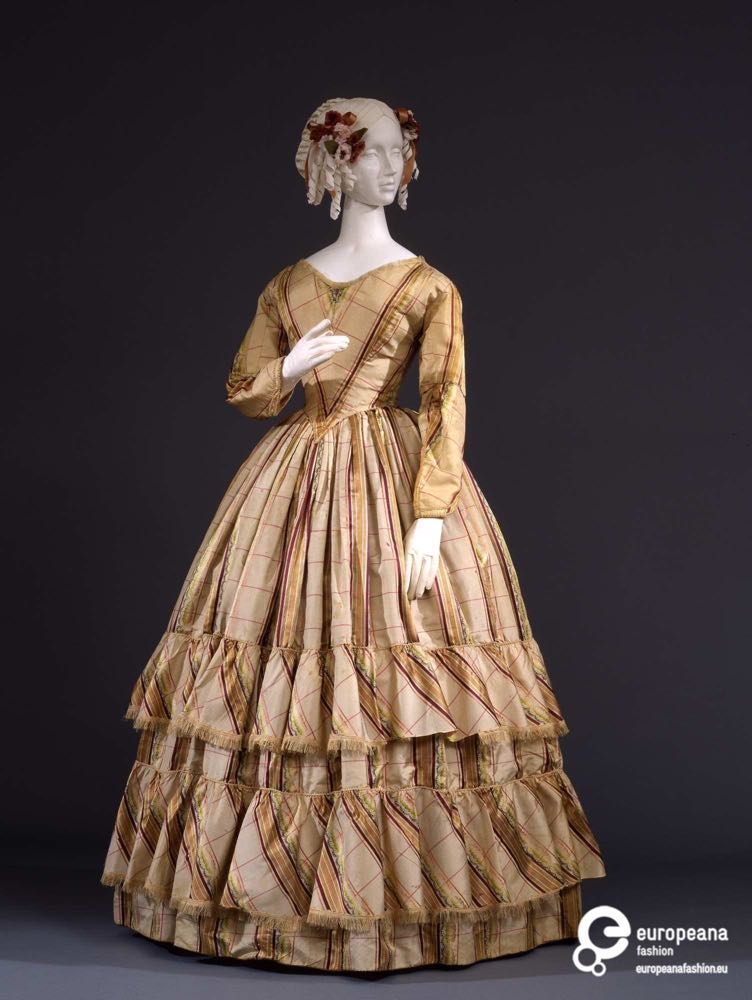
It’s the weekly interruption of the Otari Hoodie Sew Along for Rate the Dress. For this week’s frock I’ve picked something in colours that are diametrically opposite to all the teals and blues I’m working on with my Hoodies: an 1840s day dress in warm ochre gold and plum purple satin.
Last week: an early 1910s day dress in grape purple with vermillion
Nobody likes butt bows. And, as it turns out, just-below-the-front-knee bows really aren’t that much more popular. Nor are weird flaps in the back of the dress that look like it didn’t get fastened properly. But deep grape purple satin (this was at least the 4th RTD we’ve had in very similar fabrics), and 1910s, are almost always winners on Rate the Dress, and even with some discordant elements this was bound to be reasonably popular.
The Total: 8.4 out of 10
Welp, better than the butt-heart wreath and fringe of the week before!
This week: an 1840s day dress in gold stripes
Like the 1910s ‘Ring o Roses’ dress from two weeks ago, this 1840s frock features a palette of warm gold, with touches of green and pink, and a deep purple borrowed from last week’s dress.
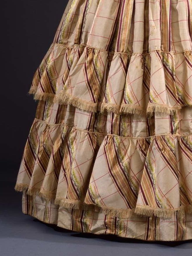
It ALSO has fringe at the hem, albeit in a much more subtle variation, just a narrow length trimming the bottom of each bias ruffle.
Similarly to last weeks dress, this garment sits between formal and informal dress. The long sleeves indicate a day dress, but the lower neckline suggests evening wear. It could have been appropriate for a less formal dinner in the cooler months, or might have been worn with a fichu or wider lace collar for daywear.
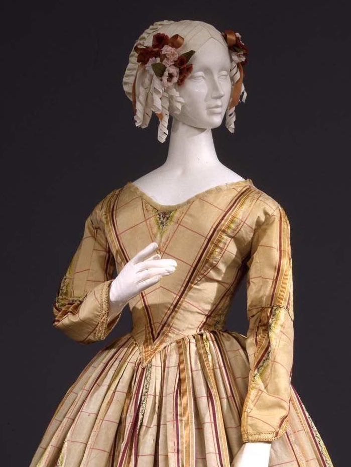
The fabric combines stripes, plaid, and a lacey figural design, typical of the inventive patterned weaves made popular by advances in the jacquard loom.
The bodice is simple, but plays with the grain of the fabric for visual effect, using the stripes to emphasise the pointed waist. The same bias is echoed in the hem ruffles.
What do you think? As an example of its era, does this dress work?
Rate the Dress on a Scale of 1 to 10
A reminder about rating — feel free to be critical if you don’t like a thing, but make sure that your comments aren’t actually insulting to those who do like a garment. Our different tastes are what make Rate the Dress so interesting. It’s no fun when a comment implies that anyone who doesn’t agree with it, or who would wear a garment, is totally lacking in taste.
(as usual, nothing more complicated than a .5. I also hugely appreciate it if you only do one rating, and set it on a line at the very end of your comment, so I can find it! Thanks in advance!)
Love it. Can see myself in this. Sadly it just won’t fit into my gardening/walking/small house life. But if only I could lead the life to which I would wish to be accustomed to …
9 out of 10. , but I wouldn’t like iron it, or any of the other dresses in this series, needless to say.
Like the colours, the simple but effective use of the fabric. Just the fringe stopped it being a 10 – reminds me too much of old lampshades.
I don’t care for this. The plaid is too thin and light, the fringe so small and thin that it looks more like frayed fabric, and it badly needs a fichu, because there is nothing of interest going on at the neckline. Or at the ends of the sleeves, for that matter, and the sleeves themselves are an odd shape.
Overall, the dress looks incomplete and odd, though the color scheme is nice. To me it’s neither beautiful nor ugly, it’s just sort of “there.”
6 out of 10.
*grabby hands* such a lovely combination of style & fabric!
10 out of ten!
I find it beautiful, but also incomplete. I think this dress highlights how important accessories were in victorian fashion. It’s very obviously missing a detachable collar or fichu, and its almost naked sleeves seem to be begging for undersleeves. I feel like its creator or owner probably had multiple options which coordinated or matched the dress to make it look more or less fancy, as required. I like the material, and think the colors would be very flattering on the right person, but I can’t help but wonder if its accessories wore out, or if some of its trim were salvaged from it to decorate another dress. I kind of like imagining different collar/fichu/sleeve combinations. I can’t help but imagine a matching collar and cuff set in broderie anglaise or a wide collar in the dress fabric for day wear options, and an elaborate, sheer lace fichu for evening. But as none of these options exist, I do find it a rather nice background dress.
7 out of 10
I think it’s beautiful.
10/10
I think it’s beautiful.
10/10
I love the skilled simplicity of the construction, the subtlety of the colorway and the restraint of the fringe element.
10 of 10
The use of pattern is very attractive, and the cut and construction look polished and professional. I would think any young lady of the time would have been proud to wear this dress.
It isn’t my favorite color palette, but it works, and I can’t detract for that.
8.5
I love the simplicity of this dress and at the same time I think it’s screaming out for some kind of adornment or embellishment. The colour scheme is a bit blah for my taste but that just means that I won’t be strolling along the promenade in it 8/10
I really don’t care much for this. The colour palette is insipid, with the plaid being too thin or fine for the size of the check. Somehow it makes it look like upholstery or curtain fabric reinterpretated. I don’t care for the neckline either; to it seems to sit wrong, although maybe with a lace collar it may feel more finished.. although for me the sleeves and cuffs are also lacking something.
Not a hit with me 6/10
I love the fabric and the way it was used in the dress design. It does seem likely to me that some embellishments are missing. I actually like it better for that, as most of the last two-thirds of the 19th century has way too much stuff on the dresses for my taste. I don’t care for the lampshade fringe on the skirt ruffles. 9/10
I find it endlessly entertaining how utterly people’s tastes vary. This one completely misses for me. I don’t care for the colour, the bias cut unbalanced plaid makes me squirm, and the ruffles are too few and too widely spaced to be impactful, the fringe strikes me as kinda tacky, and it feels too light for winter, but too heavy for summer. That said, the sleeves are kind of cool, and I do like the neckline, so…
3/10
Love these colors, the sleeves do seem kind of wonky though. 8/10
I like the dress itself, but the colour scheme isn’t doing it for me, and the first thing I thought when I saw the trim was “frayed” (which I could have chalked up to time and forgiven), not “fringe” (which I don’t have an automatic dislike for, but I don’t like THIS fringe).
7.5/10
This isn’t a period I usually like, but I love this dress. The lines are graceful, and the warm colors glow. The only drawback in my eyes, is the lower sleeves. The sleeves look too short and narrow; skimpy almost.
9/10
I love the simple and modest elegance of this dress, and like it all the more for its relative lack of ornamentation. I find the colours charming. It looks so Little Women to me. The dates are not quite right, I know. Maybe Marmee has it in a trunk in the attic from earlier, more prosperous days. 10/10
I love the bias cut of the ruffles that give the skirt movement even when hanging on the mannequin. I like the small V accent in the middle of the neckline. I imagine this would be worn with a shear pellarine. The gold would be more intense in a room lit by candles and worn by a woman with very pale skin. That said, I think the sleeves look like they had originally been elbow length and had been lengthened. Or perhaps, knowing how much material is needs to cut the sleeves of this era, they ran out of material? Perhaps they repurposed it from an evening gown into a gown for daily wear by adding sleeves? The sleeves do detract from the overall look. Then there is the frayed look produced by the fringe. I would have liked to have seen it in the plum to really accent the ruffles.
9/10
I’d say a 9. I love the color combination and the simple style. The fringe and the “swirl” on the ruffles give it a little fun. There is an elegance to the simplicity, but then one could do so much to accessorize!!
I have come to like the 1840s more and more, I simply think that it loos really comfortable, inbetween the crazy sleeves of the earlier fashion, but before the cumbersome hoopskirts. I really like this model, plain, but with just a bit of extra with the ruffles. Unfortunately the cut and shape of the dress is totally taken down by the fabric. It screams washed out upholstery to me. The colour would probably drain the colours of any bearer and make them pale and gloomy. The plaid pattern is to weak to actually bring an interest, instead I’m just getting annoyed by it. I would have skipped the extra fringe on the ruffle as well. So all in all it’s just a 5/10 from me.
I love the silhouette of this dress. The skirt is not overly fussy but holds its own well. The fabric is pleasant enough, (my eyes are bad but is there a lace strip forming part of the fabric stripe?) the fringe is a little timeworn and would not be a personal choice but it doesn’t ruin the overall appearance. The bodice however is way, way too plain and feels unbalanced and the biggest flaw for me is the sleeves, which seem to consist of two parts joined at the elbows where the fabric has been poorly matched. Not a favourite.
5/10
I like this dress, its colours appeal to me. The overall shape is lovely and I like the whole skirt. It seems to be missing a lace collar, or some other neckline embellishment. The sleeves appear to have been made half length, then someone changed their mind, and added an extra bit to make them full length.
8/10
I don’t love the base color of the dress, a drab tea. But, like others have pointed out, I feel it is incomplete. A white collar would stand out nicely against the beige. Mitts or cuffs and a burgandy shawl would make the beige seem less drab, and would actually highlight the accessories. It is a nice reminder that accessories complete the outfit. This neckline is perfect for displaying a special necklace. The seam down the front of the sleeves annoys me. Even on a manaquin, this dress has wonderful movement. It begs for you to run down the stairs, take an autumn stroll. Or call just upon your neighbors, during visiting hours, with a basket of cakes. This era seemed to get so much milage out of a plaid. the bias pattern on the ruffles is great.
8/10
One of my favourite periods. I love this but I can’t help thinking that the bodice is too plain in comparisom to the skirt.
9 out of 10
For me it is Curate’s Egg – not equal to the sum of its parts. I enjoy the details but the overall dress seems a bit meh. Although being in the UK right now I am appreciating how blinking cold it gets here and this higher neckline makes a lot of sense!
6/10
Positives:
* The color combination is excellent.
* The diagonal ruffles add a sense of motion
* Nice balance between skirt and ruffles
* Good use of the stripe in the bodice.
Negatives:
* The plaid, stripe and lacy all together is (to my modern eyes) too much. Just because you CAN weave that pattern doesn’t mean you should.
* The sleeves look cobbled together, as if they were poorly remodeled or repaired
* The bodice is oddly unembellished for the period, and too plain for the floof of the skirt. I assume it’s because bodice lace was recycled into another dress.
The fringe is a neutral – it’s not overwhelming the ruffles.
8.5
Oooo. Oooo! The colour palette is amazing, and I love the skirt! Once again, I would wear this is a heartbeat. The only quibble I have is with the fringe (somebody above said it resembles a lampshade), but that’s hardly noticeable. I’d go for a solid…
9.5/10
I like it. It’s quite understated and elegant, and I’d say it is a day dress. The neckline isn’t that low and you see plenty of fashion plates showing day dresses with similar necks. Probably had a cape or pelerine in the same fabric for additional coverage. The colours are muted but tasteful, and the proportions are good. It’s not jumping down your throat or disturbing or offering questions, but similarly, it’s not really got a wow factor for me. It’s just a really nice dress. I’d say 8/10.
A lot about it is lovely, although I agree it needs accessories. But I wouldn’t detract for that; I like that basic simplicity of 1840s fashions, and I really like the use of the plaid here – and I do like how it’s a sort of subbtler plaid. And I even like the subtle frayed fabric fringe – on this particular dress.
But the sleeve shape is odd. I wish we had more angles to look at them from so that I could figure out what’s actually going on there.
8/10
Oh, look, Spamhaus eased up on me! Yay!
Hurrah! <3
Hmmm…..
Like others the fringe to me looks like it’s just frayed fabric. It also looks like it’s missing a layer of ruffles, the spacing of them feels like there should be at least one more between the two of them.
The whole thing feels partially undone.
7 out of 10